Logos as Platforms, Branding not Badging
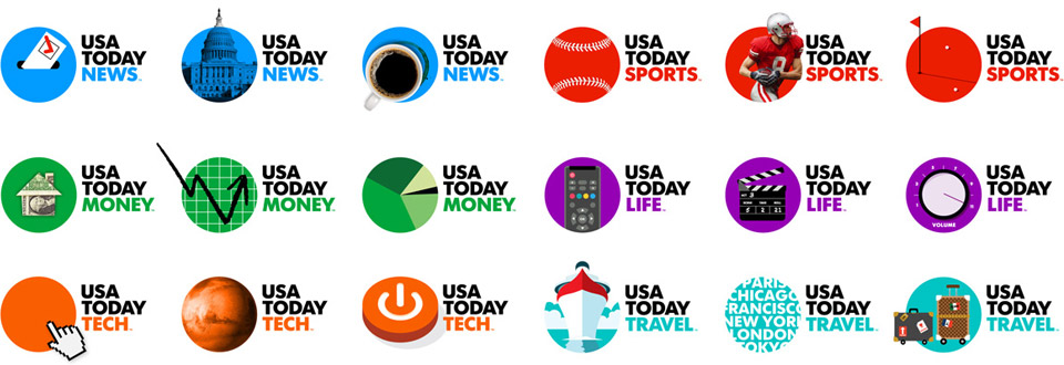
USA Today, the country's second largest newspaper1 recently unveiled a new logo and brand system that spans their entire publication—crossing platforms between web, iPad, mobile devices, and, of course, the physical newspaper designed by Wolff Olins. Rebranding an organization this large is risky. Even riskier? Rebranding an organization so steeped in tradition in a field steeped in tradition, struggling to stay afloat in an increasingly digital world. It seems impossible for a rebranding of this scale to be successful right? Don't you remember Tropicana? Or Gap? Those should be minimal compared to the backlash you'd think USA Today will get.
But the reception appears to be well-received2. The more I see the new branding and the more I read about the process behind it and plans for it to evolve, the more in awe of it I become. It's bold, it's daring, and, in my estimation, shows what the future of branding looks like.
On the new design, Kate Nielsen (the project lead) and Lisa Smith (the design director) said:
[The logo] also needed to be something that could embody the editorial spirit of the brand. On the masthead the blue circle becomes a canvas for representing the news of the day. It can change on a daily basis to represent key stories or themes from the National consciousness. It is the Newsroom's logo. A collaborative effort, editorialised and created everyday by the editors and graphics team. They should either be a clever twist (wink), a straight-to-the-point depiction, or a provocative and enticing graphic representing the related news story.
Wow. Just let the brilliance of that sink in for a bit. The blue circle becomes a canvas for representing the news of the day. Ok, ready? Let's think about what this means for branding.
The Badge
The history of branding centered around the logo—to brand something was to badge it. This rose to prominence around the middle of the century—mid fifties and sixties—along with the rise of corporate America. Designers like Paul Rand and Saul Bass are now known for their iconic logos of the time like AT&T, IBM, UPS, and United3. The logo, the mark, the symbol was the visual representation of the company. The logo was their identity. A corporation was the logo. "If this company were to split up I would give you the property, plant and equipment," said John Stuart, chairman of Quaker Oats in 1900, "and I would take the brands and the trademarks and I would fare better than you."
Up until just a few years ago, logos were simple—usually one color, easily reproducible at different sizes. Logo design was driven by the limitations of the tools: Would that mark look okay on a business card? Can we afford multi-color printing? Does this say who we are and what we are about?
"Corporations are people, my friend"
But the internet changed all that. Suddenly we weren't constrained by printing limitations—Hey, we can make drop shadows! Reflections! It glows!—and, for a while, we were caught in this awkward tension between thinking in about the old mediums and conventions but wanting to take advantage of these new tools and opportunities.
We had to go through a few years of bubble letters and fake reflections and glows to get to where we are today. Because it turns out the internet didn't just change the way we design logos, it changed the way we design brands.
A brand is no longer just a logo. (Was it ever?) A brand is now every point a company interacts with its customer. Where a company used to be a rigid, unemotional monolith, social media has turned them into living, breathing, and feeling people4. The thing about people, however, is they change. And if the logo is still the cornerstone of a company's identity, it has to be able to change and grow with its brand.
Masterplans and Platforms
Rob Giampietro, a designer infinitely smarter than myself, once compared logo design to architecture and referenced Stewart Brand's concept of shearing layers5:
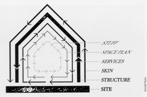
A building's shearing layers are different layers of a building that evolve as the building is occupied. Each layer changes at a different pace: the site and structure remain fairly consistent but as you go further into the space, the space plan and stuff will change more frequently. The building is a platform that evolves to meet the needs of its occupants. Rob asks: "How can an identity function not as a solution but as a framework? How can it function less like a building and more like a masterplan?"
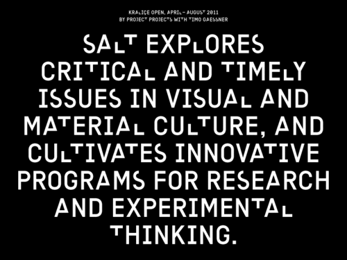
Rob's studio, Project Projects, posed this question when designing the identity for SALT, a contemporary art space, an architecture and design gallery, and a scholarly archive in Istanbul. SALT has no logo, in the strict sense: no mark, symbol, or icon. Instead, Project Projects developed a custom typeface with special S, A, L, and T characters:
The institution's name has a unique position within the identity system. The letters S-A-L-T are not represented as a formal logo mark; instead, they are embedded within a custom-designed typeface, Kraliçe, which was created by type designer Timo Gaessner for Project Projects. Equipped primarily with this typeface, the institution strategically disperses its name within the language it uses everyday.
And then to build on top of that Project Projects invites a different artist or designer to redesign those four characters every four months, essentially updating the identity. Those letters are then used in all branding elements for those four months and the artist is invited to Istanbul for a small show of their work. By doing this, SALT's identity—their logo—becomes a curatorial project of its own; a logo as an exhibition space.
Stefan Sagmeister's logo for Casa de Musica takes a similar approach. Casa de Musica is a music center in Portugal designed by Rem Kohlhaas. The logo is a three dimensional model of the building that can be rotated to show different angles and a computer program was written to generate different colors based on the type of event being performed that day so every time an artist performs at the space, their event gets a unique logo mark.
And there are many other logos that have taken this approach: AOL, Current TV, Victoria Station and even Myspace to name a few6.
Two weeks ago, I attended the Brand New Conference at the School of Visual Arts here in New York. Simon Manchipp, founder of Someone, a branding studio in London, kicked off the conference with a talk that seemed to shape the direction of the rest of the speakers. Simon's thesis is that today—in our digital, social media, non-stop, always connected world—branding is about coherency not consistency. Fifty years ago, consistency was a necessity but now it is dull and predictable. A company is no longer static, but ever changing. Branding is about the conversation now, and in developing logo and identity systems we should strive for a coherent strategy that can grow and shape with the brand.
And USA Today is perhaps the best type of organization to embrace this philosophy. News organizations understand change: they cover it everyday and now, at USA Today, their logo provides a platform, a blank canvas, to cover the news and project that change. Seeing an organization as far-reaching as USA Today embrace this feels like this idea—that a logo can be a platform, that a brand can change, that the identity is a framework—has hit mainstream and can be accepted and understood by its audience. The logo, after years of being static and unmoving, can now fully reflect its brand, ever moving, ever growing, ever changing. ✖
Notes
The Wall Street Journal takes the cake there. ↩
I admit I didn't research the reaction too much but in my cursory readings, I found minimal negativity. But also, I don't care because I love it so much. ↩
Amazingly, most of these logos still holdup today (as does much of the mid-century graphic design). ↩
This is from Brand's excellent six-part BBC series How Buildings Learn. The entire series is available for streaming on YouTube. ↩
I didn't realize it until pulling links for this piece that Aol and Current TV's logo were also done by Wolff Olins. ↩