A Workshop With Other Means
This past weekend, my classmates from MICA and I had the privilege of attending a workshop with Other Means, a Brooklyn-based graphic design studio. Other Means was founded in 2012 by Gary Fogelson, Phil Dubliner, Ryan Waller and focuses largely on print and identity work in the cultural sector. I, however, first encountered their work when my friend Rory attended the Typography Summer School in New York last summer, which Other Means runs with Fraser Muggeridge. Rory had the highest compliments after the week (we dedicated a Sway episode to it), so I was excited to work with them for a weekend.
On Saturday morning, Other Means introduced the workshop as an exploration into dialect. They wrote:
Linguists refer to the standard, accepted dialect as having prestige, of taking a dialect on or off like business clothes, and changing the way we speak depending on who we’re with — as borrowing prestige. Prestige borrowing creates interesting mutations and evolutions in language. In the early 20th century, the dialect with prestige was British, and well-to-do Americans borrowed it. They didn’t really sound British, but they drew out their vowels and dropped their r’s. Working class Americans from Baltimore, Philadelphia, New York, Boston, and the South, borrowed from that, and the dialects we recognize from those regions today are the result. Nothing like British, but with a shared DNA. A beautifully vulgar, mutant variation.
Visual languages have their own dialects. In place of grammar, vocabulary, and pronunciation there is form, hierarchy, and structure. Within the visual language of graphic design, the dialect of prestige is still the aesthetics of Modernism as it was imported to the United States prior to the second world war. Because this approach was developed alongside the growth of graphic design as a profession, it has become the standard. It’s what is taught in schools, and what is often expected by clients.
Using the text of H. L. Mencken’s book 1919 book The American Language, we were to investigate typographic dialect. The American Language was the first comprehensive study of American English, where it diverged English English and how Americans speak in a way that is very much its own language. We were asked to look through the book’s nine chapters (available on Project Gutenberg) and find a section that interests us and produce a booklet that explores those ideas typographically.
Skimming through the sections, I became fascinated by a committee that was formed in Philadelphia in late 1800s that sought to simplify the spellings of common words—it was through this committee that Americans dropped the ‘u’ from “our” words like colour, switched to “er” from “re”, as well as dropped many double letters like traveler from traveller. What interested me was though many of their proposals came to pass, many of the spellings were deemed too simple:
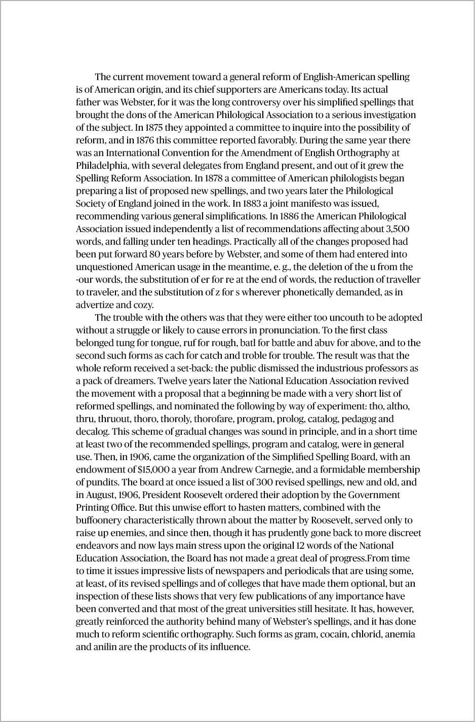
The trouble with the others was that they were either too uncouth to be adopted without a struggle or likely to cause errors in pronunciation. To the first class belonged tung for tongue, ruf for rough, batl for battle and abuv for above, and to the second such forms as cach for catch and troble for trouble. The result was that the whole reform received a set-back: the public dismissed the industrious professors as a pack of dreamers. Twelve years later the National Education Association revived the movement with a proposal that a beginning be made with a very short list of reformed spellings, and nominated the following by way of experiment: tho, altho, thru, thruout, thoro, thoroly, thorofare, program, prolog, catalog, pedagog and decalog. This scheme of gradual changes was sound in principle, and in a short time at least two of the recommended spellings, program and catalog, were in general use.
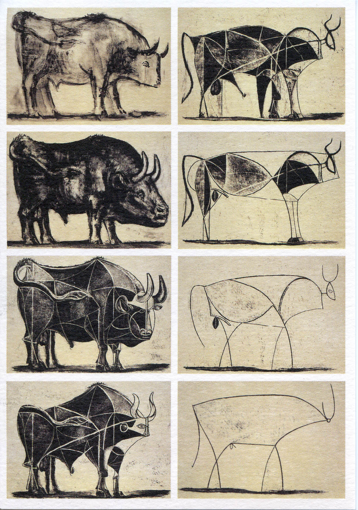
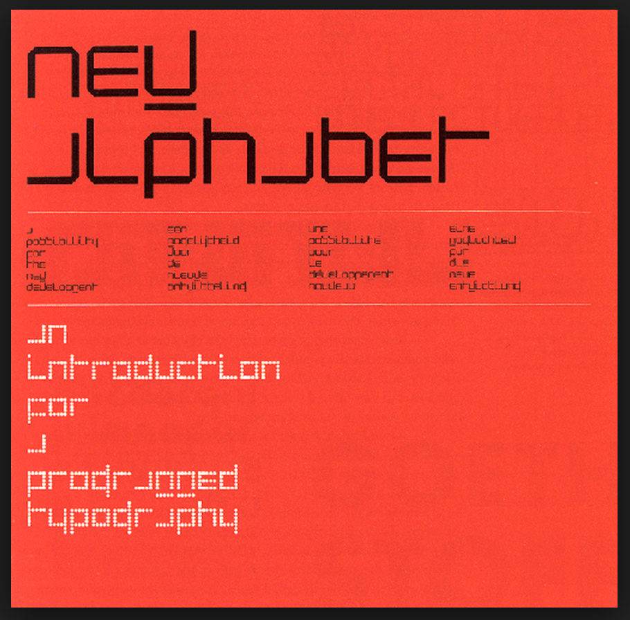
This passage hit on quite a few things I was interested in: editing, cultural changes over time, and the idea that oversimplification can lead to confusion, often obscuring clarity and losing personality and nuance. I wondered if I could show this visually. In my research, I was inspired by Picasso’s famous image of the bull and its gradual reduction of form; the visual language of concrete poetry, and Wim Crowel’s New Alphabet. Using these images as a guide and inspiration, I started playing with forms.
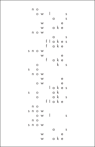
Through my exploration, I decided to take the first paragraph from the section on simplified spelling and continue through a series of steps, continually edit down the language until it was a simple sentence. This allowed me to explore my interest in editing and language, while also working through the concept of simplification.
As the paragraph repeats itself over the series of spreads, I gradually removed words while attempting to keep the meaning and overall message of the paragraph intact.
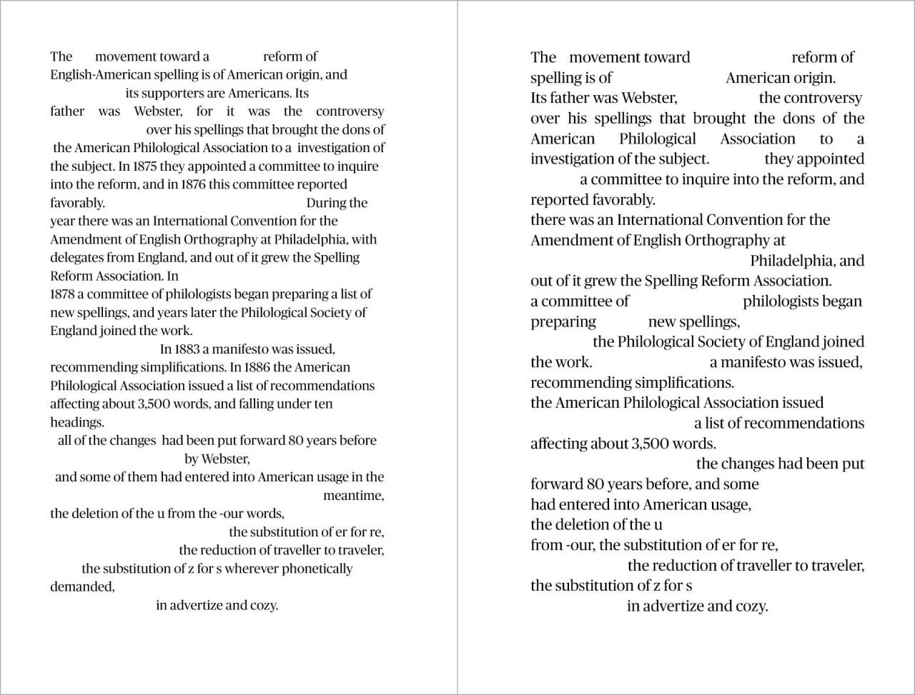
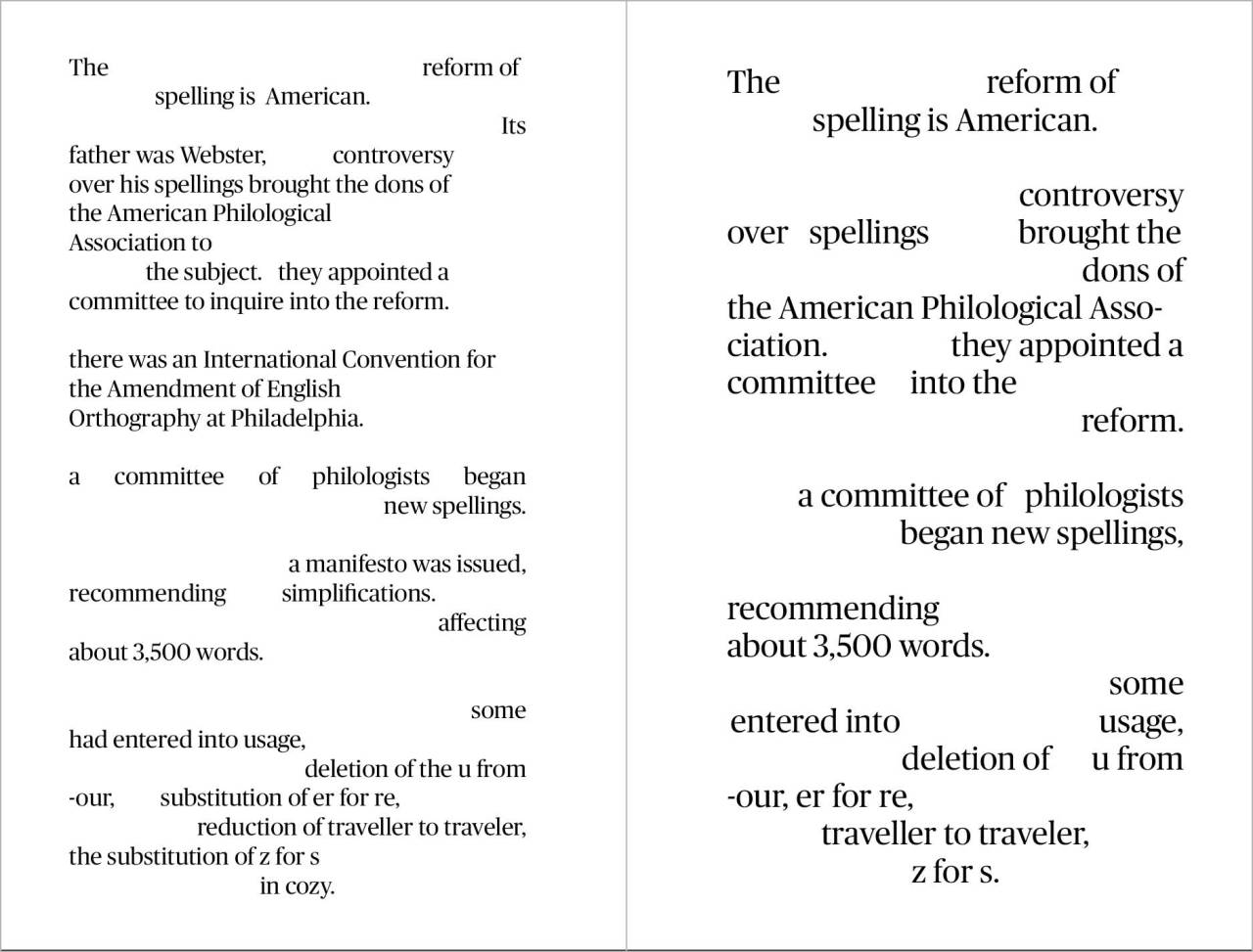
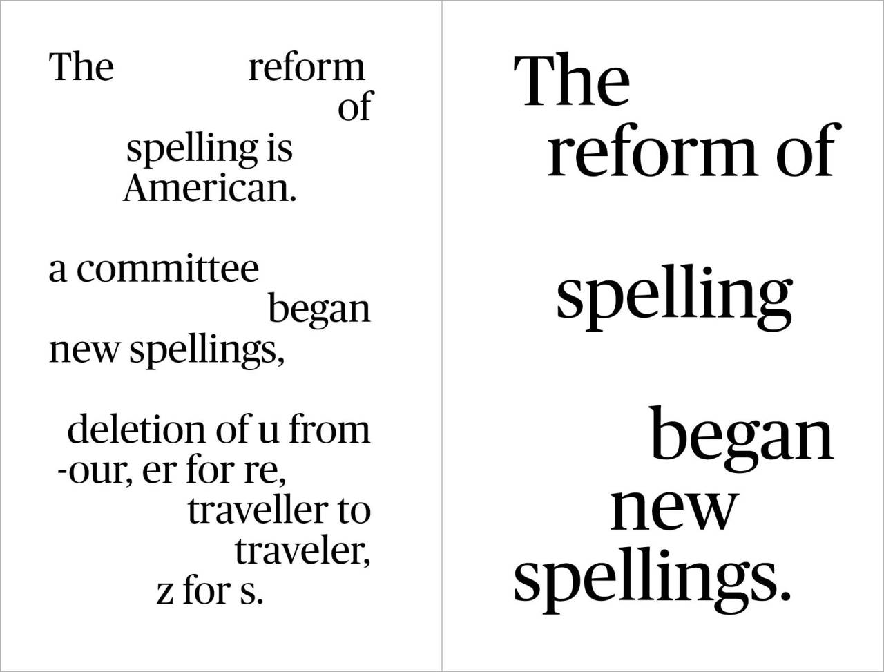
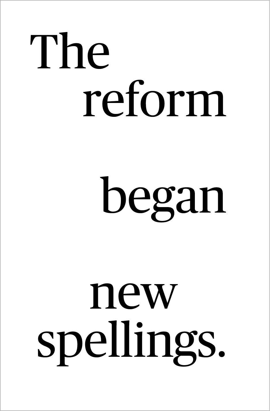
As you get to the last page, the section has been boiled down to the simple “The reform began new spellings”, that while still true, doesn’t tell the whole story and loses the background and context the larger paragraph gave. I set the type to expand to fill the same space across each page, and the placement of words tries to retain the general area on the page through each successive edit.
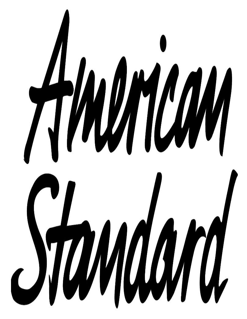
At the end of the workshop, we compiled all our booklets into one large publication called American Standard that reinterprets Mencken’s original text. The entire book is stunning and it’s amazing how well each of our experiments sit with one another.
Overall, I found the workshop to be very enlightening and a great framework to use typography to explore language, editing, and dialect in visual form. A truly successful weekend.