A Workshop with Soso Limited
This past weekend, MICA’s graphic design MFA program had the privilege of participating in a workshop with the Boston-based interactive design studio, Sosolimited. Established in 2003 at MIT by Justin Manor, John Rothenberg, and Eric Gunther, Sosolimited is both an art and technology studio that uses programming, data, and technology to create interactive exhibitions and data visualizations that function as both pieces of information design and artistic expression.
The weekend kicked off Friday evening with a presentation from Eric Gunther and Jackie Littman (a MICA alum) who would be leading the workshop. After an introduction to their work and methodology, they presented what our class would be working on for the next two days. Their prompt to us was:
The State of the Union Addresses are a lens into a changing America and a changing world. The Addresses not only report on the condition of the nation but give insight into national priorities over the years—political, social, and otherwise.
Create a poster that visualizes the historical State of the Union transcripts as data. You will learn how to use simple tools to extract different stories from the same data set. You will focus on telling a story with the data and creating an editorialized view into the content.
George Washington delivered the first State of the Union in 1790 to a joint session in Congress. Every president has continued this tradition every year, at first in written form until 1913 when Woodrow Wilson started delivering them in person. As Soso wrote in their introduction, these speeches provide an interesting lens into the current events of the country each year.
Before arriving in Baltimore, Soso wrote a small program that allowed us to search the texts of every State of the Union to see how many times any word or phrase appeared over time. We were to use this tool as an entry into this massive data set and search for a story that emerges that we could create a visual around.
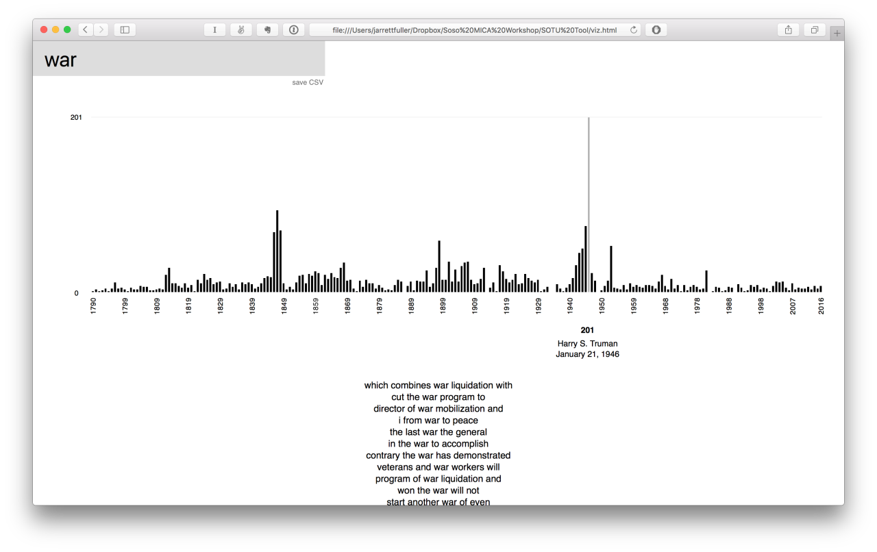
I spent most of Saturday morning combing through the speech transcripts and inputting words and phrases into Soso’s tool in search of stories or interesting narratives. My interests began with simple topics like how forward looking versus how backward look were the speeches (mentions of the future versus history), if I could uncover any clues into the history of division in the country (mentions of bipartisan, unity, etc.), or simply looking at trends in interest (economy, immigration, jobs, etc.) Out of curiosity I started typing in states I’ve lived in to see how often they were mentioned: Pennsylvania (45 times), Indiana (26 times), New York (144 times), California (152 times). Things started to get interesting here and I decided to focus my data visualization on the mentions of individual states in each address.
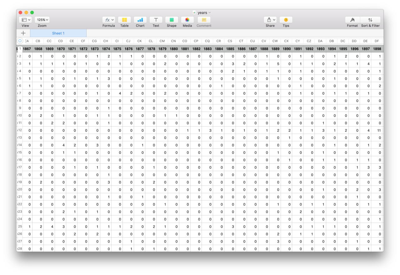
Once settling on that topic, I used Soso’s tool to pull the data of every state. I had fifty CSV files for how often each state was mentioned in each year’s report which I used to plot on separate graphs. With my interest piqued, I then dropped this data into another file to extrapolate more information such what year mentioned the most states, what president talked about individual states the most (or which one the least) what was the first state ever mentioned in a State of the Union. I also did some extra research to find correlations between events at the time that may have led to spikes in mentions or frequent references in individual speeches. With all this data, it was time to organize it all into a poster.
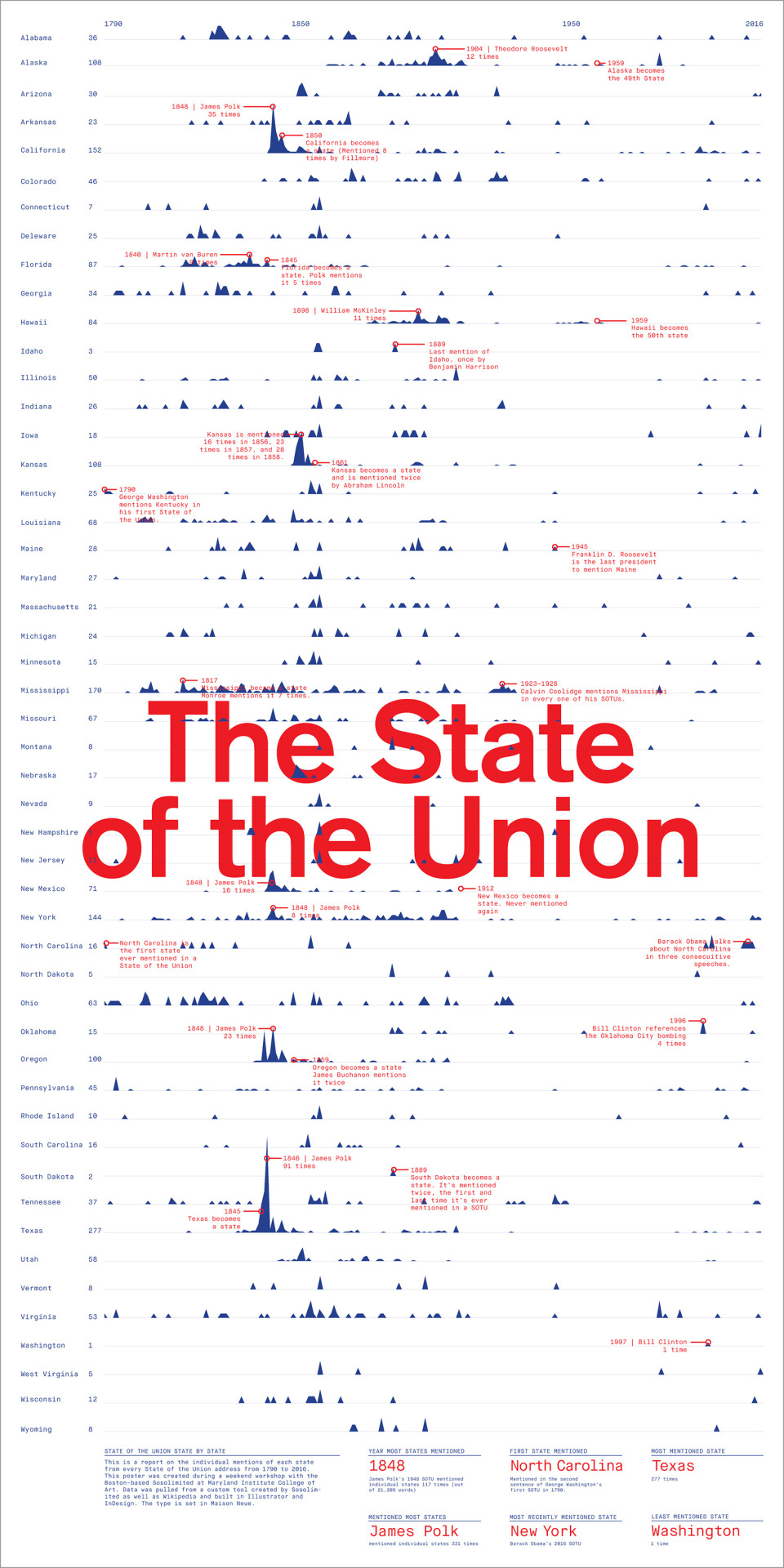
The design critic Mr. Keedy coined the term infauxmation graphics, which are graphics that appear to show data through visualizations or use the traditional tools of an information designer (charts, numbers, tables) but in reality obstruct the story and are purely visual. I didn’t want my poster to fall in this category. I wanted it to be accurate, clear, and quickly convey the story I was telling. Time moves horizontally across the poster with each state moving down the vertical axis. Zoom in and you can see individual states with annotations for peaks, valleys, and tertiary information such as when states joined the union or last mention. Zoom out and you can see trends in the data: presidents don’t mentions states as often, some states are mentioned in more addresses, etc. Across the bottom of the poster, I pulled out some relevant statistics I found fascinating: James Polk mentioned individual states the most, 1848 was the year the most states were mentioned, George Washington mentioned North Carolina in the second sentence of his first State of the Union.
On Monday morning, we presented our final posters to the rest of the class and it was amazing to see how many different ways of looking at the same data set there were. Each poster was different, both in visuals and in the data that was pulled. Data Visualization has long been an interest of mine, and it was a great weekend to spend time looking at new datasets and flexing those skills in a different way. I think the class agrees with me: it was a successful weekend.