Typeface and Interface
“Fonts need to be edited just as carefully as texts do—and may need to be reedited, like texts, when their circumstances change. The editing of fonts, like the editing of texts, begin before their birth and never ends.” —Robert Bringhurst
“A programmer writes some code and inevitably makes the mistakes that result in the malfunctions called bugs. Then, for some period of time, normally longer than the time it takes to design and write the code in the first place, the programmer tries to remove the mistakes.” —Ellen Ullman
Interface
Software is eating everything around us—our books, our cameras, our watches, our world. For better and for worse, software is replacing centuries-old technology, freeing them from their fixed past, moving them to a networked, editable, and ever-changing future. The German designer and writer Gui Bonsiepe believes that in the future all designers will be “interface designers”1, for in times of information overload, it’s more important for the designer to design the access to information, the navigation through it, than to design the form of individual messages.
Digital interfaces are designed and developed in an iterative fashion. Where the designer historically designed artifacts in isolation before putting them out into the world fully formed and finished, the interface learns and improves based on its interactions. Developers will release a minimum viable product to learn how the consumer reacts to it: Where do they click? What is working? What is missing? Are there bugs? The release isn’t the end of development—the engineers keep working, refining, fixing, improving.
The writer historically saw her work as finished when it was committed to print—published, released, and read. When the words are complete, it is sent to printing presses, bound, printed and fixed. But the interface has become both the place of creation and consumption, the mode of production dramatically reduced. What happens when the same screen is used to write/create/design but also to distribute/consume/view? In his essay, WYSIWYG, Michael Rock writes:
Perhaps the most significant implication of the WYSIWYG revolution was to bring immediacy back to the process of typography. Now we compose on a screen that simulates the page we have in mind. With that innovation, typography is reunited with writing: the sketch is the design. We still take the sentence as raw material but the work of typography is a real-time elaboration of the language. This is amplified by the fact that the finished product is now often distributed on the very medium on which it is composed, the monitor. The permanent become permanently transient. So now the question becomes: when is typography done?
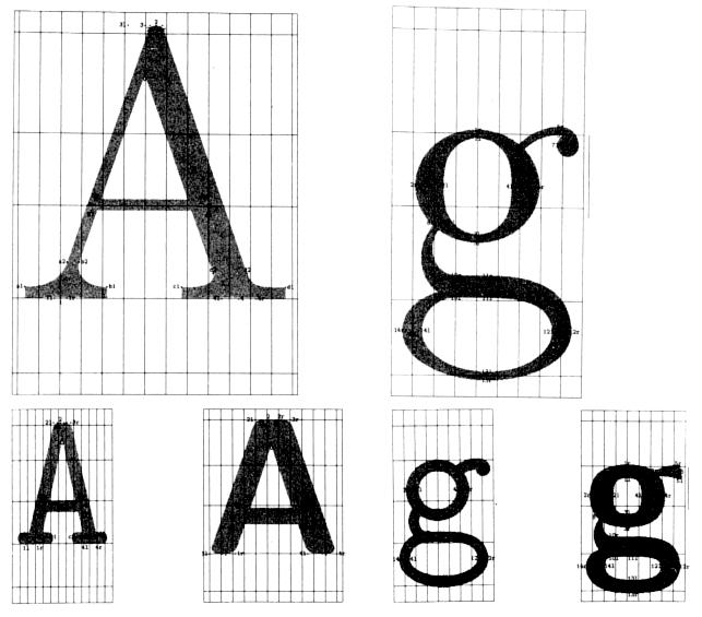
Typography has historically been a fixed artifact. Perhaps the longest surviving pieces of graphic design are typefaces—fixed in time, but forever repurposed again and again, year after year. The process of designing a typeface, in a very McLuhan way, has been shaped by the production of the printed text. The early production of type faces was a manual process—letterforms carved in hardwood and set individually, letter by letter, on the press. By the late 1800s, type designers would draw each letterform at large scales which would be traced by engraving machines.
When Kadist Arts Foundation needed a new logotype in 2010, they commissioned Dexter Sinister, seeking mark that suggested change and mutation, rather than a static corporate brand. Dexter Sinister, the designer/artist duo of David Reinfurt and Stuart Bailey, employed a typeface they designed called Meta-the-difference-between-the-two-Font, which raises the same question as Rock: when is typography done?
Meta-the-difference-between-the-two-Font was developed using MetaFont, the now thirty-year old typography system and the first digital font program.
Metafont
Donald Knuth didn’t set out to be a typographer. After receiving a bachelor of science in physics and a PhD in mathematics, Knuth started teaching at Caltech in 1963 and was commissioned to write a book on computer programming language compilers. The book, The Art of Computer Programming, quickly grew into a series of seven volumes, the first published in 1968.
Knuth had high standards for the printed appearance of his books. The first volume was typeset using mechanical hot type in Monotype Modern 8A but in 1977, due to financial restrictions, volume 2 was set to be printed with new optical typesetting. At the time, the optical typesetting used lower-quality faces, often just copies from the ones designed for Monotype and other foundries. This meant the details and features that Knuth loved seeing on the pages would be lost, replaced with a lower quality facsimile.
Knuth saw typesetting as analogous to programming and started developing a program to set and render type digitally—one or zero, ink or no ink. In 1978, he released TeX, a typesetting system, and Metafont, the programming language.
Knuth suggested that the design of one letterform, an “A’ for example, presupposes all sorts of design decisions for the other 25 characters. Metafont allowed the user to generate an unlimited number of fonts based on a limited number of parameters such as weight and slant. Following Metafont, Apple and Microsoft developed TrueType and Adobe created PostScript, both outline font standards. Metafont was different in that it didn’t create outlines but rather a series of vectors that could be edited and changed based on variables in the program. For example, within the code, one could adjust the slant or weight with a variable that would then affect the entire font and then output their design as a Postscript bitmap file.
Where Metafont allowed for infinite design decisions based on limited parameters at different points in time, when Dexter Sinister created Meta-the-difference-between-the-two-Font they wondered if they could make time its own parameter that could also be adjusted. In the Kadist identity, the duo signed a ten-year contract and programmed their face to change everyday—adapting a set of five variables—pen, weight, slant, superbness, and curliness—subtly each day over the next decade. Each time Kadist needs a font, the software produces a new, unique version.
They describe their typeface as a typographic oxymoron: a single typeface that is also many typefaces.
Spirit
Software, unlike a typeface, is not a fixed artifact. Software is famously forever unfinished—living, breathing lines of code that can be edited, updated, refined, and changed. Updates get pushed to our phones and computers while we sleep, gifting us with new features and fixing bugs.
When Apple released iOS9, the operating system for iPhones, iPads, and the Apple Watch, in 2015, they abandoned Helvetica, the typeface used on the iPhone since it launched in 2007 with San Francisco, a face designed in house by Apple for their software. A few months later, the Mac’s operating system, OS X El Capitan, also replaced Helvetica (which replaced Lucida Grande a year earlier) with San Francisco.
The three major operating systems—from Apple, Google, and Microsoft—are now using custom typography as system fonts. Microsoft unveiled Segoe UI along with Windows 7 (adapted from Steve Mattoon’s Segoe, replacing Tahoma), and Google released Roboto in 2007, designed especially for their Android devices.
When a typeface lives in a digital-only setting, and even more so in a closed system like iOS or Android, the production of the typeface is no longer fixed. It no longer has to remain a static, unchanging artifact like it has for all its history. The design and production of a typeface could, hypothetically, borrow the process of software—released with incremental changes, improvements, and new features overtime. Google has already started experimenting with this. In a piece for New York Magazine, Kevin Roose writes how Roboto has already evolved since its first appearance:
Unlike pre-digital fonts, which were essentially set in stone after being finished, Google got to keep working on Roboto. And in subsequent editions, the typeface got a face-lift. The uppercase B got a little slimmer. The comma was made less angular. “The old model for releasing metal typefaces doesn’t make sense for an operating system that is constantly improving,” Duarte said. “As the system evolves over time, the type should evolve along with it.”
Apple seems to view San Francisco in the same way. So far, the face has only appeared in the interface and developed as a digital native face2. ”San Francisco is a modern font,” writes Akinori Machino, “It will change the typefaces dynamically according to the context. It is a kind of “Digital Native” fonts for the digital age.” There are multiple version of the font and the operating system can serve up the appropriate letterforms depending on the context. The watch, for example, uses a slightly condensed version. Like a traditional face, there are Display and Text faces but the software can detect the specified size and switch to the appropriate weight.
Apple can update, refine, and edit San Francisco and push it to our devices with each software update if it wished, leaving no record of how it looked before, save for those who don’t download the new release. San Francisco is its own typographic oxymoron—a single typeface that is also many typefaces.
In 1985, fellow mathematician Douglas Hofstadter read about Metafont in an article Knuth wrote in a publication called Visible Language. Hofstadter, inspired by Knuth’s theory, believed there was more to type design than mathematical proportions and fixed parameters: “Clearly there is much more going on in typefaces than meets the eye,” he wrote, “underneath or behind each instance of ‘A’ there lurks a concept, a Platonic entity, a spirit.” He went on write about the difference between “the letter of the law” and “the spirit of the law”—lawyers interpret the law, he argued, bringing their own experiences to it and therefore changing and evolving laws to fit the new time. He believed typefaces may be the same way.
Leonardo da Vinci is credited with saying a painting is never finished, only abandoned. The same is true of software. Software is a living piece of code—constantly being updated, refined, corrected, and added to. There never comes a moment when an application or a website is complete. To borrow Bonsiepe’s prediction, perhaps a type designer is an interface designer. “A design today is rarely a substantive, realized product.” writes Max Bruinsma in his essay, An Ideal Design is Not Yet, “More and more often it is a proposal that gains its final form in the interaction with the audience, for better or for worse.”
The same is true of the typeface: an artifact is static, but the spirit moves. ✖
Notes
I learned about Bonsiepe’s work in the exhibition catalog for the 2013 show All Possible Futures, organized by Jon Sueda in San Francisco. ↩
Although I wouldn’t be surprised if they start using it in marketing material as well. They are using San Francisco in the word marks for the Apple Watch and Apple Music but the rest of their new marketing, website, and advertising still use Myriad. ↩