On the graphic design of the 2016 Presidential Campaign
The Master Brander
Early in Donald Trump’s 2016 presidential campaign — before he started winning primaries, before he became the Republican nominee, before he became the president of the United States and his campaign was still something we could laugh about — Bill Clinton was asked by Stephen Colbert on The Late Show why he thought the New York socialite was doing so well in the polls. Clinton responded simply: “he’s a master brander.” It's true. We've seen long shot candidates run for president to build their own brands before (see: Herman Cain, Ben Carson, Carly Fiorina, et al) but Trump was our first brand to run for president. If Donald Trump is good at anything, it is branding. His fortune comes less from building than it does branding. He has put his name on every thing from steaks to planes, vodka to magazines. Branding — cultivated and manifested through graphic design — has become central to how political candidates present themselves to perspective voters. Trump understands the power of name recognition and the development of his public persona. In court filings, he's claimed his name alone is worth $3 million.
Crafting a particular image can have as much effect on how one will vote as the policies a candidate represents and Donald Trump used his own brand to shape his image as a presidential candidate. In the 1967 book, The Image 1, Daniel Boorstin writes:
In the United States, the making of images is everyday business. The image has reached out from commerce to the worlds of education and politics, and into every corner of our daily lives. Our churches, our charities, our schools, our universities, all now seek favorable images of them. Our national politics has become a competitions for images or between images, rather than between ideals. The domination of campaigning by television simply dramatizes this fact. An effective President must be every year more concerned with projecting images of himself.
In 2016, we had two candidates who, even before running for president, had a universal name recognition and fully developed images. Mrs. Clinton spent her life in public service — as a first lady, a senator, a secretary of state. Depending on your political affiliations, you saw her as a public servant or power-hungry, selfless or self-serving, ambitious or arrogant. The same goes for Donald Trump who went from real estate tycoon to New York tabloid fixture to reality television star. “If ‘The Apprentice’ didn’t get Trump elected, it is surely what made him electable," wrote The New Yorker's Emily Nussbaum, "Over fourteen seasons, the television producer Mark Burnett helped turn the Donald Trump of the late nineties—the disgraced huckster who had trashed Atlantic City; a tabloid pariah to whom no bank would lend—into a titan of industry, nationally admired for being, in his own words, ‘the highest-quality brand.’”
The election was framed as opposing images: the establishment versus the outsider. Hillary Clinton was the establishment — she’s smart, experienced, pragmatic. And Trump, the outsider — a straight-talking businessman. These images manifested themselves in every area of the campaign from stump speeches, to social media, to graphic design. Clinton’s pragmatism was displayed through traditional stump speeches, always on-script and always well-prepared. Trump's campaign, however, was notorious for off-the-cuff rallies where he talked about whatever was on his mind. On social media, the Clinton campaign was highly edited with well produced images and videos. Trump’s was his own voice complete with simple sentence structures, frequent typos, and careless retweets. Clinton announced her campaign with a slick video, debuting a new logo mark — a capital H with an arrow crossing the middle — that was seen on everything the campaign produced for the next eighteen months. Trump stood behind a podium in Trump Tower with a blue sign that read "Make America Great Again!"
Corporations are people too
In the early seventies, the principles of Swiss Modernism — strict grids, sans-serif typefaces, and black and white photography — co-opted by capitalism, became a dominant subset of graphic design called corporate identity. Designers like Paul Rand, Massimo Vignelli, and Saul Bass created elaborate and detailed style guides that outlines how a company should present themselves visually. A new identity was built around a logo, usually a simple one-color icon that would, as I was taught in design school, "look as good on a billboard as on a business card". From there, typefaces were selected to match the new iconography, grids were put in place to develop letterheads, business cards, and advertising mockups. Books were produced that outlined all the rules: a logo should have x-amount of space around it and never be smaller than a quarter inch. Do not stretch or change the logo of the logo. Don't swap out typefaces.
As technology progressed and companies evolved, the identity systems and style guides designed a decade or two ago no longer reflected the current moment. New companies were less interested in a single, iconographic symbol that somehow had to embody everything they represented. Websites and social media allowed companies to be flexible, to talk directly to their customers in a variety of mediums and tones. Suddenly, a corporate wasn't a singular, unchanging entity but a multi-faceted, ever changing personality. (Or as a previous presidential candidate once gaffed: "Corporations are people too.") Corporate identity was subsumed by a larger, catch-all term: branding. No longer was a company's identity primarily defined by a single logo but was considered across every consumer touchpoint from language used in customer service callcenters to the style of a tweet to the type of photo posted to Instagram. With a brand, designers were tasked with thinking not just visually but systematically.
A brand is no longer a single logo but a complete designed system that is carried out across platforms both in print and digitally, in both physical and digital environments, and always lives within a larger cultural context2. Every touchpoint — every interaction with the customer, viewer, or user — from iconography to advertising campaigns, logos to colors has been designed to feel of a whole, as if it's coming from the same place. The marker of a good brand is less about consistency than it is coherency. A brand, then, becomes a type of performance — a series of visual representations of a single larger idea — that exists within a particular time and place and presented to a particular audience.
The Marxist critic Raymond Williams writes that cultural criticism focuses too much on the object as opposed to the systems that make those objects, becoming a type of 'consumption theory.' “I think the true crisis in cultural theory...is between this view of the work of art as object and the alternative view of art as a practice...we have to break from the common procedure of isolating the object and then discovering its components," he writes, "On the contrary we have to discover the nature of a practice and then its conditions.” 3
The same goes for brands. For the designer, the brand's value is often determined by its relationship to the principles of Swiss Modernism and traditional corporate identity ideals. A critique of a brand system should not simply be a formal critique — one that looks solely at its shapes, colors, and typography — but also a critique of how it performs — how it responds to its context and reflects the company, person, or politician it's representing. To critique the graphic design of each campaign in the model of Williams — to examine the system instead of the artifact — allows us to reevaluate the tenants of branding and begin to understand how the graphic design of each candidate appealed to a particular set of voters and perfectly reflected the person at the top of their respective ticket.
The Candidate as Corporation
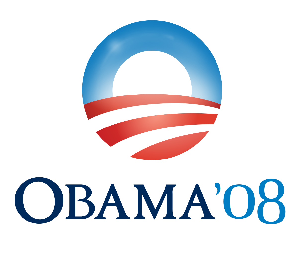
In 2008, then-senator Barack Obama's first national campaign redefined presidential campaign branding with the now-famous "O" logo designed by the Chicago-based designer Sol Sender. In addition to that simple icon, Obama's design team developed a full identity system: everything from the website to campaign signs to merchandise was set in the contemporary American typeface Gotham, in the same blue, and always emblazoned with the logo. Before 2008, there was little attention paid to graphic design in presidential campaigns which usually consisted of simple logos with a similar variety of stars, stripes, and eagles set next to the candidate’s name. Sender and his team — who had never worked on a political campaign before — borrowed the graphic design practices of large corporations to create a coherent style guide creating a consistency that helped establish Obama, who was then largely unknown, on a national stage. Michael Beirut told Newsweek at the time:
Is Obama’s stuff on the level with the best commercial brand design? I think it’s just as good or better. I have sophisticated clients who pay me and other people well to try to keep them on the straight and narrow, and they have trouble getting everything set in the same typeface. And he seems to be able to do it in Cleveland and Cincinnati and Houston and San Antonio. Every time you look, all those signs are perfect. It’s unprecedented and inconceivable to us.
Graphic designers immediately started talking about how Obama's campaign would change all campaign branding. In the future, we thought, every candidate would consider graphic design an important part of their campaign and borrow the methods of corporate identity development to frame their presidential ambitions.
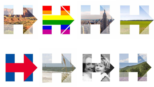
Yet only one candidate borrowed the Obama campaign's candidate-as-corporate-identity philosophy in the most recent presidential election. Throughout the 2016 campaign, much had been made of Hillary Clinton's "H-arrow" logo and the branding system her in-house design team built around it. The campaign hired Beirut to design the mark in early 2015, which like the Obama O, was seen on all campaign materials going forward, including a stage, complete with a custom typeface designed by a Brooklyn-based typographer just for Clinton. A natural progression from the revolutionary design employed by Barack Obama's initial campaign, for graphic designers, the Clinton design system was seen as the better brand — coherent, consistent, and refined to the smallest details — compared to her Republican opponent.
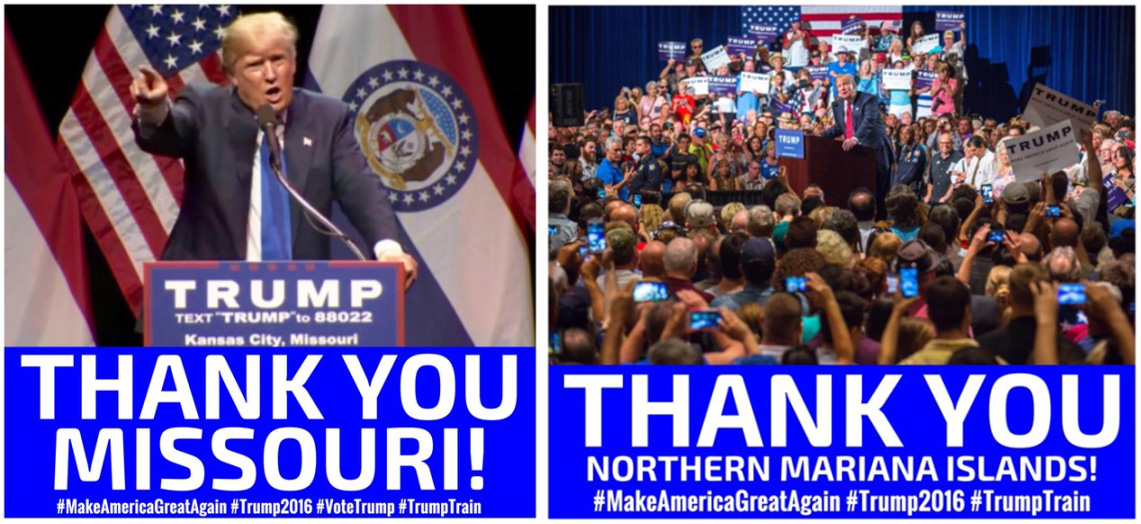
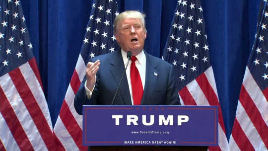
When Donald Trump announced he was running for president in June 2015, he stood in front of a blue wall, flanked by American flags. Fixed to the front of his podium was a simple blue sign with nothing but his name, his website URL, and his campaign slogan. The sign felt almost undesigned — two nondescript san-serif typefaces on a blue background. The only ornamentation was a thin red border with five stars across the top. You could swap his name for the last name of any of the other candidates and no one would know the difference. In the nearly two years since the escalator ride seen around the world, his campaign graphic design didn't get any clearer or refined, making it hard to even call it a design system. In fact, there didn't appear to be any effort put into the imagery his campaign released — the hero images on his social media pages were pixelated and the graphics he tweeted after he won a state's primary used Photoshop's default color and type settings. The campaign distributed two signs to supporters at his rallies: one was the inverse of the sign he stood behind at his initial announcement — white sign with blue text — and the other read “The Silent Majority Stands with Trump.” The inconsistencies between them were numerous—his name was set in different typefaces, the blues weren't the same, and the “silent majority” signs introduced a serif typeface that never appeared on any other campaign material. (And let us not forget early July 2016 when the campaign debuted the infamous Trump-Pence logo after the announcement of his running mate was quickly replaced after it was mocked for iconography that resembled a sex act.)
Red Hats and Coastal Elites
But this doesn't necessarily mean that the Trump campaign weren't thinking about the image they were projecting. Trump, perhaps more than any candidate in history, understood the power of branding and in his appeal to middle class voters — the people in "middle America" opposed to "the coastal elite" — a tightly designed branding system may represent everything they are against. Where Obama and Hillary's graphic design were rooted in the principles of corporate identity design, Trump's appeared DIY, handmade, undesigned. This allowed him to distance himself from the establishment while tying his opponent to the types of corporations and establishments his voters were weary of. Trump's campaign branding came not in a strong logo or expensive branding campaign, but in something that would reach those who's votes he was trying to win: his campaign reportedly spent more on red baseball hats than it did on polling. In The New Yorker, the design critic Rob Walker writes of Trump's infamous Make America Great Again hat:
A workaday cap with a corny slogan rendered in capital letters, this hardly seemed a candidate for iconic-object status when the year began. But, by mid-summer, the Los Angeles Times writer Carolina A. Miranda correctly identified it as “the ‘I Like Ike’ button and Obama ‘Hope’ poster of our time—the official objet d’art of an election that has turned into one long, bad-hair-day episode of reality TV.” Perhaps the fact that it was as underrated as the candidate it promoted only underscores the point. “It’s infuriatingly good,” George Lois, the famous art director and designer, told Miranda. While notable for the screaming red of its most popular iteration, a color choice that seemed to make the cap gather visual force in crowds, this product will win no design awards; its aesthetic is perfunctory to the point of crudeness. But, as another expert in that field commented, “If the objective of design is to communicate and sell—it works wonders.”
This red hat, purposely or not, represents that middle American sensibility. The bright red, when photographed in the flood of people at his large rallies, became a powerful image in itself. By spending money on these simple, almost undesigned, hats instead of an expensive branding campaign from a high-end New York design firm, Trump's brand felt like it was of the people, not a tightly-designed system that came from the top down, reflecting the populist message he campaigned on.
These images also manifested themselves in each campaign's graphic design. Graphically, both candidates built upon and subverted the branding strategy of Obama’s 2008 campaign. In 2008, Obama was the outsider who used strong graphic design and the methods of corporate branding to legitimize himself and help him with credibility. Eight years later, Clinton followed that playbook, but not as an outsider — she used her graphic design to reinforce her image. A campaign built upon pragmatism, experience, trust needs tight, well-thought-out, expansive graphic design to help amplify that. Trump, on the other hand, completely subverted this idea. Unlike Obama and Clinton, he wanted to be seen as the outsider, the common man, the straight-talker. By eschewing brand standards and any semblance of a style guide, his graphic design suggested a campaign that’s grassroots: of the people and off-the-cuff. “For his presidential campaign, his typography is as quiet as he is loud," the design writer Steven Heller writes in Wired, "The type is bold, but serifs are eliminated in favor of a sans serif similar to Franklin Gothic, while his slogan 'Make America Great Again, possibly in Gill Sans, is garnished with five discrete stars. It is no frills and no thrills, which has certain advantages.”
After the election, Beirut reflected on the logo he had designed for Clinton and began to question the value of a purely formalist view of graphic design:
In many ways, going to design school is all about surrounding yourself with a beautifully crafted bubble. At least it was for me. Most normal people don’t know or care about custom typography, the fine distinctions between nearly identical colors, dynamic graphic identity—any of that stuff. Growing up in the rust belt, I certainly didn’t. With each class assignment, with each studio critique, I became more skilled as a designer and I became further from normal. Moving to New York put me at the center of a highly specialized profession practicing what would have seemed to my old friends in Ohio like a hopelessly esoteric brand of black magic.
Donald Trump’s graphics were easy to dismiss. They combined the design sensibility of the Home Shopping Network with the tone of a Nigerian scam email. Like so many other complacent Democrats, my only question was: Why is this even close? Armies of smart people generated oceans of words in the aftermath of the election trying to figure out what happened. Talented pundits and strategists and pollsters, all masters of their craft, were wracked with self-doubt. I too wondered if the very thing I was so good at had somehow betrayed me. We had spent months developing a logo; Trump had spent years building a brand. Had Trump won not in spite of his terrible design work, but because of it?
It’s easy to look at Hillary Clinton’s graphic design and see it as the better of the two but the graphic design of both campaigns turned out to be the perfect visual manifestation of the candidates running. Any type of graphic design around them would only reinforce the commonly-held perceptions of them. When Clinton’s supporters continually saw her highly produced, well-made, and consistent graphics, it subtly reinforces the image they have of Clinton herself — competent, organized, prepared — while her detractors saw this as the opposite: fake, cold, distant. And the same goes for Trump: when his detractors read his Twitter feed and saw his haphazard graphic design — complete with pixelated images and default Photoshop styles — they saw that as a representation of someone who was not prepared for the presidency, vulgar, a joke. But his supporters? When they saw these same images, they saw someone who seemed just like them: unpolished, straight-talking, grassroots, and wearing a red baseball cap.
Notes
× This essay is a revised version of several shorter piece I wrote on my blog throughout the 2016 election and it's immediate aftermath.
-
I've previously written about Daniel Boorstin's seminal book here. ↩︎
-
For more on branding, identity systems, and mascots, read this Other Means's essay on the Walker Art Center site. ↩︎
-
From Problems in Materialism and Culture (1974). ↩︎