Design Criticism Is Everywhere—Why Are We Still Looking For It?

This piece was originally published by AIGA / Eye on Design
We graphic designers have a love-hate relationship with criticism. We say we want more of it and then complain when we get it. We want the general public to understand what we do, yet when they write about our work, we pick apart how they got it wrong. We say we want a seat at the table, to be respected by business, but then complain that all we get is a devolved ‘design thinking.’ For people who market themselves as clear communicators, we have a hard time explaining what it is we actually do, let alone articulate what the criticism we continually call for should look like. Ask a dozen designers what graphic design criticism is and you’ll get a dozen different answers.
This is the question writer Rick Poynor asked designer Michael Rock in the now-seminal dialog published in Eye Magazine in 1995, “What Is This Thing Called Graphic Design Criticism?” “Compared to art or film criticism, the term ‘graphic design criticism’ has an unfamiliar, slightly uncomfortable ring,” Poynor begins. “It is one that even the most avid reader of graphic design magazines and books will encounter rarely, if at all.” The two go on to discuss the relationship between design and writing and what type of design criticism they want to see more of. Where Poynor articulates a type of ‘journalistic criticism’ that frames a designer or designed object in a larger context, Rock was interested in applying cultural criticism, like literary theory or semiotics, to design writing.
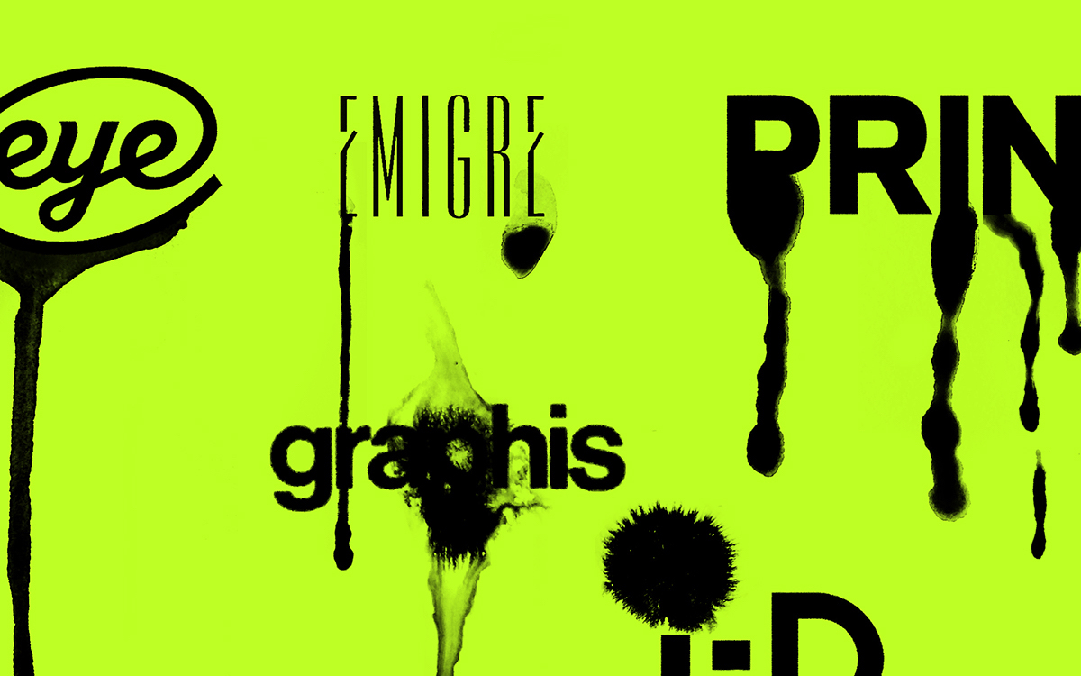
The conversation was published in the middle of a kind of a design criticism renaissance. Poynor’s own Eye magazine was a leading design publication, along with Emigre, the Bay Area avant garde magazine from the eponymous type foundry by Rudy VanderLans and Zuzana Licko. Around the same time, magazines like Print and I.D. (where Rock was a graphic design journalist) began publishing critical pieces on graphic design, as were the handful of academic journals dedicated to design. A year earlier, designers Michael Beirut, William Drenttel, and design writer, and historian Steven Heller published the first book in the Looking Closer series, an anthology of the best recent design writing that, over the next decade, would span five volumes. Indeed, this was an era of abundance. Photoshop 1.0—released in 1990 for $850 for the Macintosh Plus—lowered the bar for entry, speeding up the design process and allowing for more complex layouts and a new wave of typeface design. Debates raged between the modernists, who were skeptical of the new aesthetics emerging, and postmodernists interested in pushing the limits of this new technology. So it’s not surprising to find Rock optimistic about the future of criticism at the end of his conversation with Poynor: “We are perhaps the first generation of writers who consider themselves, as a form of self-definition, to be graphic design critics, and that sense of being at the beginning of something is extremely liberating.”