An interview with Experimental Jetset
I’m not sure Experimental Jetset needs an introduction. The Amsterdam-based design trio consisting of Danny van den Dungen, Erwin Brinkers, and Marieke Stolk have been working since 1997 and are a staple in both history and studio courses. Their work ranges from printed matter to site-specific installations but always retains a recognizable thought process and aesthetic.
I don’t remember when I first came across their work, but it feels like I’ve been a fan of their work for as long as I’ve been a designer. As a Helvetica-loving undergrad student, I was immediately attracted to their blend of Swiss Modernism and punk aesthetics. And as someone interested in design theory, I was equally drawn to the detailed summaries they wrote about their process on their website.
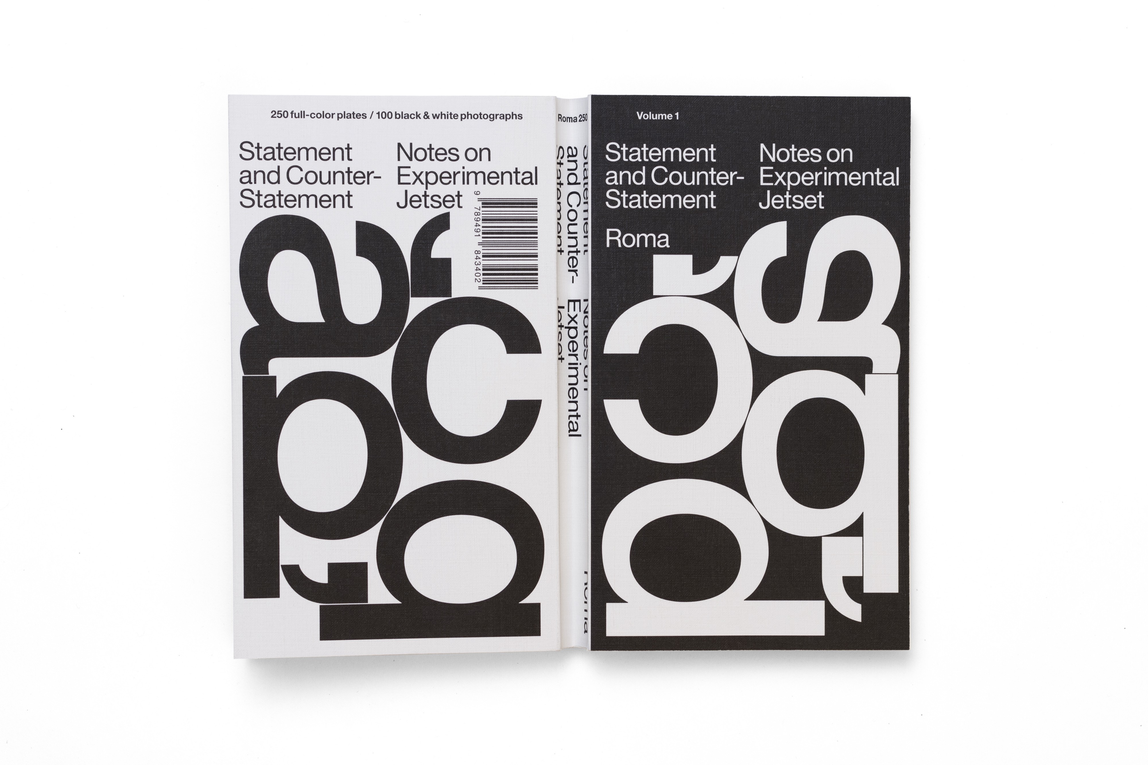
But I found myself really thinking about the studio’s work in a deeper way last summer when I interned at The Whitney Museum of American Art’s in-house design team, between my two years of graduate school. In 2013, as the museum prepared to move to a new location in lower Manhattan, Experimental Jetset was commissioned to rebrand. Their solution — dubbed “the responsive W” — was an innovative and reflexive identity system that, to me, felt completely unexpected and strangely perfect. While spending my days working with the identity during my internship, I picked up their recent monograph, Statement and Counter-Statement in an attempt to better understand their work and methodology. In a review I wrote of the book in August, I said:
It occurs to me that they are one of the few studios we can confidently call auteurs. Flipping through these pages, as projects and quotations blur together, spanning twenty years, a decidedly clear worldview, a consistent practice, emerges. They’ve been able to operate at the fringes of the field, consistently enacting their theories and aesthetics in projects large and small, from small European publishers to large American museums, with equal rigor and authority.
And this is still what’s so interesting to me about Experimental Jetset’s work. Over the last few months, I’ve been emailing back and forth with the trio to talk about their work, the role of writing and theory in their practice, and how they think about the current state of design criticism. I’m thankful for the time they spend considering their answers, which were consistently thoughtful, interesting, and provocative. I’ve enjoyed getting to know them better through these exchanges. I’m honored and excited to include an edited version of our exchanges below in this special text-edition of Scratching the Surface.
Although I’d been following your work for years, it wasn’t until reading Statement and Counter-Statement that I realized how you’d been able to inject your own point of view and visual aesthetic into all your work, regardless of client. Was this a conscious decision?*
We’ve always seen graphic design as a legitimate platform for creativity, authorship and self-expression — we’ve never regarded it in any other way.
When we applied to the Gerrit Rietveld Academie, 25 years ago (time does fly), we certainly didn’t go there to become ‘neutral’, ‘objective’, manager-type, business-minded ‘problem-solvers’ — we went there to find a way to express ourselves.
We came from a background of making zines, publishing mini-comics, screenprinting band-shirts, etc. Applying to an art school seemed a logical way to pursue these activities. This was the beginning of the ’90s, when we were still in our early twenties — we just came out of the ’80s, which we spent as teenagers completely immersed in post-punk subcultures (from two-tone ska to hardcore punk, from new wave to garage rock, from psychobilly to trash metal, and everything in-between).
And this ’80s post-punk landscape was incredibly important to us — to kids like us, coming from working-class backgrounds, post-punk had an almost emancipatory effect. Through record sleeves and fanzines, we learned about movements such as Dada, Surrealism, Constructivism, and the Situationists — so in that sense, post-punk was our cultural education.
But it was also through post-punk that we got our first taste of authorship, of self-expression. We produced little zines and comics, which we traded through channels such as Maximum Rock & Roll and Factsheet Five — all in all, this was a very formative period for us.
So when we arrived at art school, this whole post-punk period was still very much a part of our outlook. And the Rietveld Academie only made this sense of authorship stronger.
One thing you have to understand about the Rietveld Academie is that it is more or less rooted in movements such as Bauhaus and De Stijl. In fact, the architect of the building, Gerrit Rietveld, was once (in his younger years) a full-fledged member of De Stijl — and although Rietveld had removed himself somewhat from some of his earlier ideas by the time he designed the school, we like to think that the spirit of De Stijl is still very much alive in the building.
In other words — the Rietveld Academie was, during the time we studied there, pretty much dedicated to the synthesis of all arts (and perhaps even more importantly, the synthesis of art and the everyday).
In a practical sense, this meant that there was no distinction made between the arts — there was no hierarchical division. Painting wasn’t seen as a ‘higher’ art than fashion design, for example. The school was completely open and transparent, without any real borders between the departments. In fact, the first year of the school (the ‘Vorkurs’, modelled after the Bauhaus) is a shared year for all students, during which everybody has to study the same principles: model drawing, pinhole photography, etc. So somehow, our post-punk sense of authorship blended quite naturally with this Bauhaus-style idea of artistic egalitarianism — the idea that every human activity is basically a potential platform for self-expression.
(In that sense, a very important text for us is still the founding manifesto of the Bauhaus, from 1919, in which Gropius describes society metaphorically as a building, almost as a cathedral — a Gesamtkunswerk, in which there should be no distinction between the artist and the craftsman).
This may all sound terribly idealistic and utopian — but this idea of the Gesamtkunstwerk was a very real situation for us, while studying at the Rietveld Academie.
To give a very concrete example of this — a lot of the parties and gigs that took place at the squats and venues that we went to, in the early- to mid-’90s, were pretty much collective artworks, put together by art school students and young artists. There were places like Vrieshuis Amerika and Pakhuis Afrika, squatted warehouses where students and artists had their studios, spaces that were turned into surreal environments — we can still remember a complete Wild West village built in one of these warehouses.
These artist-built environments were used as settings for parties and concerts — events in which everybody was involved. The DJs, the bands, the people taking care of the sound and the light, the people standing behind the bar, the people standing in front of the bar — most of these people were art students, using the event as a platform for self-expression, for individual authorship. But it was precisely this convergence of individual authorship that created this sense of collectivity.
Some of our fellow-students even ran a vegetarian restaurant from Vrieshuis Amerika (in fact, it was at this restaurant that we were first introduced to Paul Elliman, who was brought there by Linda van Deursen — this was in the mid-’90s, when Linda was still our teacher).
And of course, graphic design students (such as ourselves) played an important role in that Gesamtkunstwerk as well — by creating flyers for these parties, by producing zines that were distributed during these events, by making shirts for the bands that played. During this period, we actually designed a lot of shirts and record sleeves for this Amsterdam-based punk band NRA (an acronym that didn’t really stood for anything, or stood for Not Really Anything, depending on who you asked). And we never thought of these flyers, zines, sleeves and shirts as being ‘neutral’, ‘objective’ vessels, for other people’s ideas — it simply didn’t occur to us that people could have such a ‘servile’ approach towards graphic design. To us, this whole idea of post-punk, and of going to art school, was exactly this urge to get away from the feeling of being told what to do, this longing to escape the expectations of our own working-class background. We certainly weren’t looking for bosses.
So we always saw the work we created around that time as a platform for authorship — as an opportunity to talk about our own influences, our own interests. This was our contribution to the party, to the Gesamtkunstwerk, so to speak.
And we still feel about our work that way. We’ve never seen our work as ‘objective’, or ’neutral’, or ‘functionalist’, or ‘rational’. From the very beginning, our impulse was to express ourselves. We simply don’t know any other way.
Writing all this, we suddenly remember one particular scene, in one of the short-lived squats (if memory serves us well, it was this place called ‘Onder de Bogen’ — a series of arch-shaped studios, situated underneath an Amsterdam railway). We were there one night, basically to keep the space occupied — there wasn’t a party or anything, but the point was to stay in the squat until the next morning, because there were rumors the space would be evacuated at dawn. And as long as there would be a few people in the space, and some furniture, the squat couldn’t be simply evacuated. At that time, there was a law stating that when a space looked inhabited, the cops would need a special permit to enter the space — so the strategy was always to keep the space occupied, at all times.
Anyway, while we were going through that long and freezing night, there was also another person in the space: a solemn artist, silently working on a giant disco/mirror/glitter ball — an enormous piece he was creating for an upcoming party, in another squat. There couldn’t have been a bigger contrast between that outrageous glitter ball, and the gloominess of that night.
So you could ask yourself — what exactly was that guy creating? A sculpture? A piece of interior design? A theatrical prop? A political statement? A manifestation of self-expression? A gesture of servitude? Who actually cares?
In the end, it might all turn out to have been nothing but a therapeutic activity — something to keep your mind distracted from the fact that the cops will sooner or later show up, to evacuate the place, and tear down the Gesamtkunstwerk. But until that time, you might as well keep working on that glitter ball, and try to make it as big as possible.
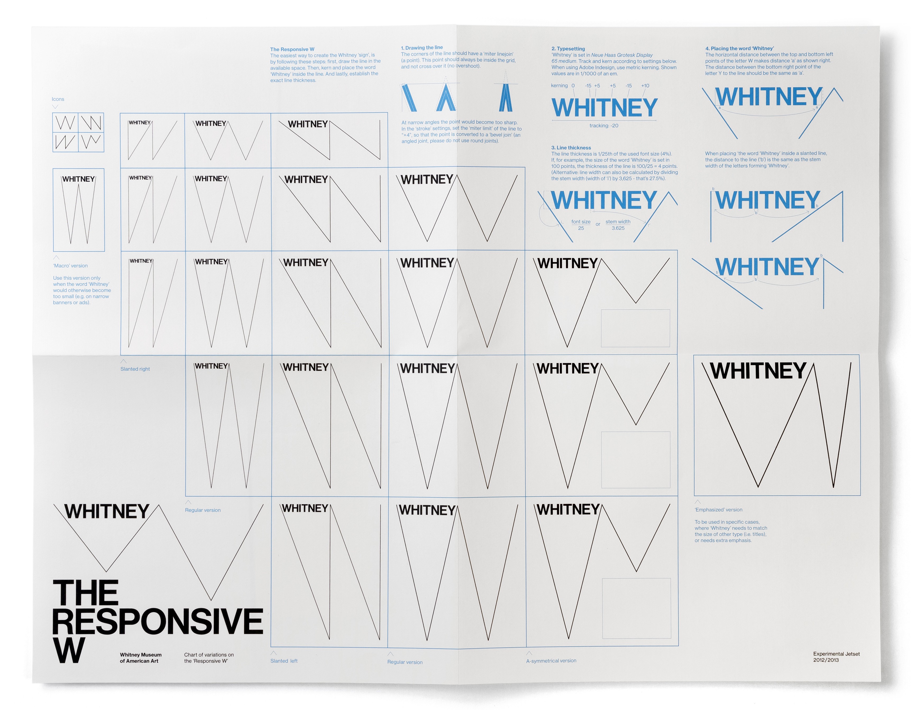
Because I interned at the Whitney this past summer, I’ve been thinking a lot about the responsive W. By responding to the surface, the W makes the viewer — and the design itself — aware of its edges. It’s almost like the design is conscious of being a piece of design (I think?). I think in this sense, it could be read as a critique of its surface, or even a critique of logos/branding in general. Thinking about this and the idea of authorship, I’m curious how you think about your work as a critical activity?
In fact, your interpretation of the critical dimension of the Responsive W feels completely relevant to us — it is very close to our own intentions.
We do see our work as a critical activity — but this notion of criticality is completely integrated in our way of working, and in our general outlook. It’s not the sort of criticality that can be measured in a simplistic “critical of what?” way. And it certainly has nothing to do with the notion of criticism as ‘calling out’ or attacking fellow-designers — you can go through all the writings on our website (and it is a disturbing amount of text, we agree), but you won’t find any negative remarks about other designers. We simply have too much of a sense of solidarity for that. (In the end, we’re old-fashioned social-democrats — we feel that we, as workers, should keep a closed front towards outside forces trying to divide us internally).
But having said that — we do think that our work is driven more by negative impulses than positive impulses. We don’t design because we ‘love’ type, or ‘love’ paper, or ‘love’ the smell of ink. We know some other designers can talk for hours about their passion for certain typefaces, or certain bindings, or certain sorts of paper — but we don’t really have that.
We always have the feeling that we’re designing AGAINST something — a certain visual landscape, or a certain mode of representation, that we want to question through our way of working.
We already wrote a lot on this subject, so we won’t repeat it in full — but in short: in our work, we try to go against a visual culture that is focused on images, on representations, on projections. It’s a very classic (by now almost cliché) ‘Debordian’ position we try to uphold here — this idea of going against ‘the spectacle’ and its alienating effects. Or better yet — the idea of finding a way to somehow exist within the spectacle, and going against the spectacle, at the same time. By referring, in our work, to all sorts of possible material gestures (overprinting, folding, perforating, tearing, self-referentiality, etc.), we try to make the viewer/reader aware that he/she is (first of all) looking at a printed, material object — an object that is made by humans, and thus also can be changed by humans. So that’s our own (perhaps quite naive) attempt to go against the alienation of dominant modes of representation.
In the case of the Whitney, it was exactly a dominant way of representation that we wanted to question. And the current dominant way of institutional graphic representation is really to show a full-colour reproduction of the artwork on the poster, giving the viewer the feeling to have experienced the artwork just by looking at that poster — something we feel is very ‘false’, in a way. But of course, the Whitney expected us to come up with such a solution nonetheless — in other words, we had to use the full-colour reproduction, there was no way around it. So we were thinking — if this poster really should be a mirror, just reproducing an existing artwork — maybe we should make people aware that they are indeed looking at a mirror. And what better way to do this than by cracking the mirror? So this is exactly what we did — the W-shaped line is literally a crack on the surface of the poster. Brecht once said that art shouldn’t be a mirror, but a hammer — and in the case of the graphic identity of the Whitney, we took the hammer to the mirror. Or at least, we tried.
One of things that’s interesting (and unique) about your website are your extensive descriptions about your projects. (Again, I’m thinking about the great writing you have around the Whitney redesign.) What place does writing have in your design process and how does writing these descriptions influence your design practice? When in the process do you start writing those? Is it at the end for the website or are you continually writing and rewriting about your work (for clients, for yourself, for your website, etc)?
These are just some loose, almost random notes we just penned down, on the subject of writing:
I
We actually don’t really distinguish between writing and sketching — so writing certainly plays an important role in our design process. People sometimes say that a picture is worth a thousand words — but we sometimes feel the opposite is the case. Some ideas are simply better expressed in words than in pictures.
II
As for the texts on our website: they do serve to explain our projects, but not necessarily to others. We mainly use these texts as a way to explain the work to ourselves. It’s a form of self-reflection that has been very helpful to us, and it takes place before, during and after the design process. Like we said, it’s really an integral part of the process itself — it’s like having a constant dialogue with ourselves.
But we sometimes doubt whether these texts are really helpful to others — if anything, they rather complicate our projects than clarify them. Also, we noticed we have become very vulnerable by publishing these texts online — we’re a very easy target for critics.
III
A while ago, one of our Werkplaats Typografie students (Christof Nüssli, to be precise) pointed us to a very helpful text by Thomas Hirschhorn, titled ‘Why do I write about my work?’.
It’s a text that really resonates with us, and we agree with many of Hirschhorn’s points.
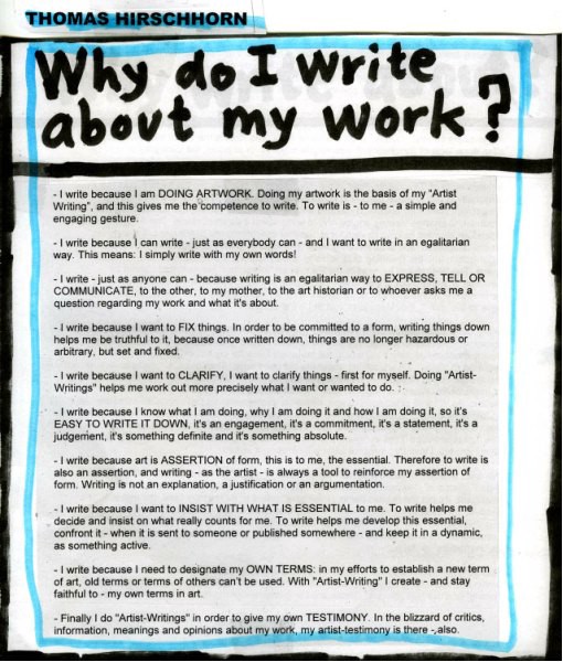 ‘Why Do I Write About My Work’, Thomas Hirschhorn, retrieved from gramsci-monument.com (2013)
IV.
One thing that you should keep in mind though — writing doesn’t come naturally to us. We don’t come from an academic background, and we fully realize that our skills are totally insufficient. We always feel like imposters — as writers, as designers, as lecturers, as teachers.
Fact is — other than the name suggests, the Rietveld Academie is not an academy in the Anglo-Saxon sense of the word — it isn’t a university, or a place that gives you an academic degree. It is basically a trade school — it’s the sort of education that in the Netherlands is called ‘beroepsonderwijs’, training you to be a skilled manual worker, like a plumber or a carpenter. We’re not complaining (far from that), and we wouldn’t have wanted it any other way — we’re secretly quite happy with the ‘anti-theoretical’ streak within the Rietveld Academie. But we just want to make the point that we aren’t natural-born writers, or proper intellectuals, or real academics. We’re just designers who happen to write — nothing more, nothing less.
Having said that — we do feel that writing enables us (sometimes even more so than drawing, or talking) to think in a more elastic way. Through words, you can forge unexpected connections — things that go against the ‘common sense’ of the verbal.
As we already said, we aren’t proper intellectuals — as people with a non-academic background, a lot of scholarly texts look quite impenetrable to us. But it is exactly the fact that these texts seem so alien to us that also makes them so magical to us.
We have to admit we quite like the deep, shadowy, opaque jargon of cultural critique, of existentialist philosophy, of post-marxist essays. In our eyes, these texts are like gnostic spells, enabling the user to make strings of associations that seem totally impossible, and arrive at conclusions that are almost otherworldly. There’s a mantra-ish, lyrical/poetical quality to a lot of these tracts: the negation of the negation, paradoxes and dialectics, searching for the essence of words by looking at their etymology, the notion of the stream-of-consciousness, strings of associations, and all this other wordplay… We really love that whole dynamic of dialectical thinking, and wished we somehow had the skills to incorporate that in our own writing — but we simply haven’t.
V. On top of that, there’s the language difference — we aren’t native English speakers, which means that we have a strange relationship with the texts we write anyway. In fact, we could never write a text like this paragraph in Dutch — it’s the use of English that forces us (or better said, allows us) into a certain way of reasoning, a certain way of letting words rhyme and chime with each other. In Dutch, we would write and reason in a completely different way, and thus arrive at totally different conclusions.
Something that’s interesting to me about reading interviews you’ve previously done, or even reading Statement and Counter-Statement, is how you talk just as much about theorists and writers (Walter Benjamin, Marx, etc) as you do designers (Wim Crouwel, etc). How do theory and history influence your work? Do you see ways that these writers’ work manifests itself in your visual work?
A while ago (in 2013, to be precise) we were asked a very similar question, for a different interview — and the reply we gave then would really answer your question as well. So we couldn’t resist just repeating it here.
In that interview, we were asked about the way in which our “philosophical approach” has informed our graphic design practice.
And we answered that it is actually more the other way around — it is our graphic design practice that has informed (and keeps informing) our ‘philosophical’ approach (if you can call it that).
As we already explained elsewhere in this interview, we actually don’t have a proper theoretical or academic background — it really is through our daily practice that we keep coming across all these (more or less) theoretical concepts (and then we piece them together, in a rather primitive, haphazard way — we’re theory savages rather than theory-savvy, we have to admit).
For example, in 2007 we were working on the graphic identity of Le Cent Quatre (104), a French cultural institute that was situated in a large, roofed street — basically a passage, or arcade. Doing research for this project, we automatically came across Walter Benjamin’s Arcades Project — which immediately had a huge impact on our way of working and thinking, and keeps on inspiring us ever since.
A similar thing happened when we were working on the graphic identity of the Whitney. Thinking about instructions and notations, we remembered an essay by the Welsh, New Left scholar Raymond Williams, in which he basically defines art as a form of notation. And this idea (of art-as-notation) then immediately became part of the design process, amplifying ideas we already had, but were (until then) unable to articulate.
I’m curious about how you think about design criticism. How do you feel about the current dialogue around graphic design? What issues or topics would you like to see more designers talking/writing about?
We have always been criticized publicly — already since the moment we graduated. In 1997, we redesigned a pop-cultural Dutch magazine called Blvd. (a redesign that also doubled as our graduation project), and this project was harshly criticized — not only in Dutch design magazines, but also in national newspapers. We were baptized by fire — which also had a certain liberating effect; from that moment on, we felt we had absolutely nothing to lose.
This really set the tone for the rest of our career (if you can call it a career) — and we’ve been drip-fed with a steady stream of heavy criticism ever since. It’s safe to say we aren’t exactly the critics’ favorites — to put it very, very mildly. But again — to us, this overall critical dismissal has always felt more like blessing than a curse, as paradoxical as it may sound. The fact that we’ve never recognized ourselves in the words of the critics forced us to come up with our own words to describe our work, so to speak.
In other words, we are wondering if we are the right persons to address the theme of design criticism — we feel we are already too biased.
Having said that — recently, we’ve been thinking a lot about the subject of criticism (while trying to keep our own personal experiences out of it).
We do feel there is something ‘awkward’ about the notion of graphic design criticism (as opposed to art criticism, music criticism, film criticism, etc.) — and call us crazy, but we do think that some of that awkwardness might have something to do with class. Bear with us as we talk you through our own little theory:
Somehow, the discipline of graphic design grew out of the printing industry — so it has certain working-class roots (keep in mind that we are talking here about the history of graphic design as a discipline, not about the background of individual graphic designers).
In fact, printing is not only deeply connected to the notion of labour, but also to the labour movement (think of Régis Debray, who described these links so eloquently in ‘Socialism and Print’, an essay which appeared in issue 46 of New Left Review — it can be found online under the title ‘Socialism: A Life-Cycle’). In this regard, it’s interesting to note (although not mentioned by Debray) that the first labour union in the Netherlands was in fact the union of typographers.
So it’s fair to say that printing and labour are intrinsically linked — and graphic design, which grew out of the printing industry, still shares this background. Sure, graphic design underwent a certain social upwards mobility, emancipating itself from the printing press, gaining some sort of social-economic and artistic autonomy — but in the end, graphic designers are still the sons and daughters of the printing press. The discipline of criticism, in its present-day form, grew out of a totally different background — a much more bourgeois tradition (again, keep in mind that we are talking here about criticism as a literary genre, not about the background of individual critics). Oxbridge-educated criticasters, discussing books, music, morals and ethics in the columns of 19th century newspapers, redefining a new sort of etiquette for the aristocratic classes in a rapidly changing, modernizing world. What to do, how to behave, what books to read, what music to listen to, etc. And on top of that, there was the polemic as an extension of gentlemanly dueling — a last remainder of this whole idea of the nobility.
In that sense, criticism is basically the bourgeoisie reflecting on itself (sometimes through the mirror of bohemia), in order to constantly correct itself. Fast-forward a century or so, and both graphic design and criticism seem completely disconnected from their roots, their original backgrounds — nowadays, both disciplines inhabit more or less the same cultural stratosphere. And yet, it is our belief that somewhere, deep in the ‘collective subconsciousness’ of these disciplines, there are still traces left of their respective histories.
Critics (even graphic designers acting as critics) often place themselves above designers, taking on the role of cultural ‘gate-keepers’ — trying to dictate, to these masses of ‘ordinary graphic designers’, a certain canon, a certain etiquette. The idea is still that graphic designers can’t really think for themselves — that they’ll always need critics, more educated people, to somehow think for them. Graphic designers should be told what to read, how to act, how to think, how to write. Critics will never grow tired of subtly reminding us that graphic design, as a discipline in itself, is still a bit dumb, a bit incorrect, a bit tainted, a bit dirty — dirty as the hands of a printer.
So, in our view, the awkwardness of graphic design criticism (or at last, the awkwardness that we ourselves experience when we read design criticism — as opposed, for example, to the joy that we experience when reading music criticism) has a lot to doth with these class dynamics. We often recognize, in the patronizing tone of the critic, faint echoes of the voice of the boss (the ‘patron’ in ‘patronizing’), the judge, the aristocrat, the clergyman. We just can’t help it.
As we said — call us crazy. We realize that this is a total crackpot theory. People will ridicule us for it. Also, we realize this is all a bit unfair and harsh towards some of our friends, who are working very hard to put design criticism on the map.
But still, we do believe there is a grain of truth in it