The Five Obstructions
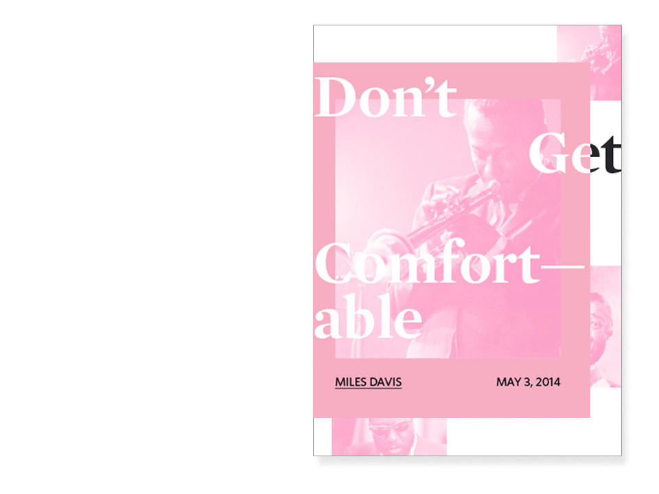
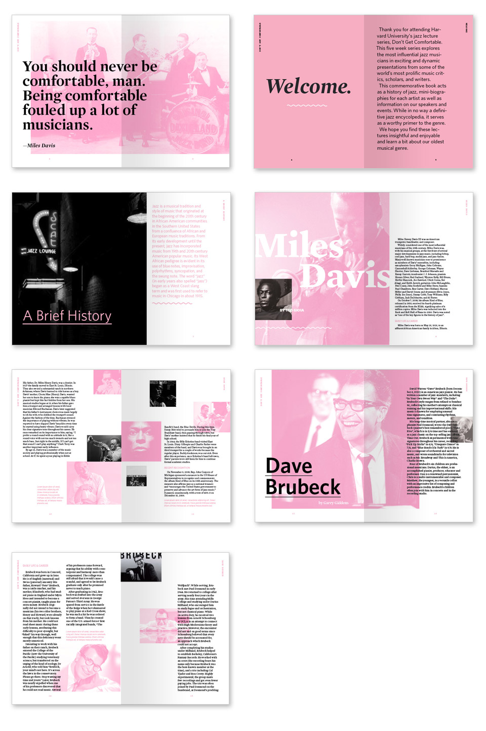
The Five Obstructions is a 2003 Danish film by Lars von Trier and Jørgen Leth. In the film, Von Trier gives Leth, his friend and mentor, the task of remaking The Perfect Human—von Trier's favorite film—five times, each time with a different 'obstruction' (or obstacle) given by von Trier. In the second episode of the Sway podcast, Rory King and I discussed the The Five Obstructions as a framework for a class assignment that forces students to work within constraints to focus on processes, research, and experimentation. We adapted the concept for Sway by selecting a favorite project of each others and then spent five weeks between March 12 and April 30, 2014 to have each other redesign it five times under various constraints. Rory had me rethink my Don't Get Comfortable booklet and I asked him to redesign his identity system for Nuit Noir.
- Design
- Pedagogy
- Workshop
- Research
Week One
Obstructions
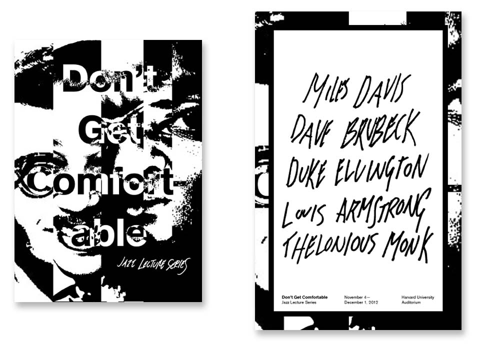
- Research the aesthetics of “extreme-music” genres: black metal, grindcore, hardcore punk, etc.
- Everything must be high-contrast black and white. No color. No grayscale.
- There must be handmade elements on each spread: typography, illustrations, distressed scans, collage, whatever.
- Don’t use a grid. Everything should be arranged arbitrarily and with intuition.
- There must be at least one additional piece of collateral in addition to the booklet: flyer, postcard, obi-strip for booklet, invite, etc. Think of ways to break up the booklet into different pieces of collateral.
Solution
There were two obstructions that gave me the most trouble going into this week’s project: that the book must be all black and white (no grayscale) and that each spread must have a hand-drawn element. The all black and white obstruction upset me at first—while I liked your view that jazz could be seen as an extreme music genre like black metal and hardcore punk, I felt like you were imposing an aesthetic you liked on this project even though, at first look, it didn’t seem to fit. However, once I was in working on it, I was able to take elements of extreme music aesthetics and fuse them with a style that (1) still felt like my point of view was coming through and (2) took inspiration from trade paperbacks of the sixties and seventies (most notable, The Medium is the Massage, designed by Quentin Fiore). Fiore’s work was seen as subversive and counter-cultural just like jazz. I drew inspiration from that mindset in producing this book which echoes nicely the philosophies of extreme music genres. The hand-drawn elements find their way into the book through various typographic flourishes that bleed in from the edges of page and only fully reveal themselves on the promotional poster that flips the focus from photography to typography.
Week One: Rory
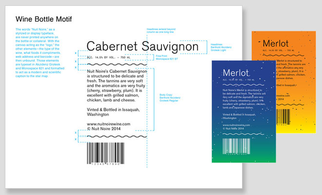
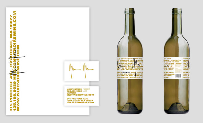
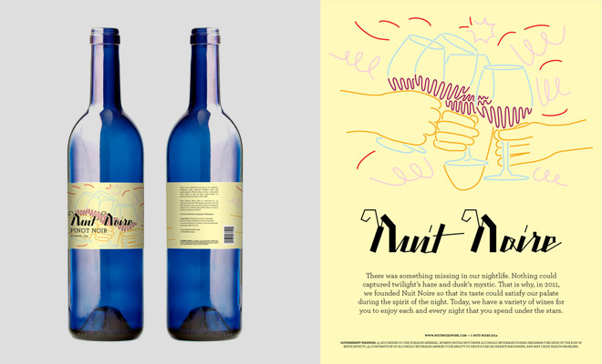
- Nuit Noire is boutique winery that wants to emphasize the craft of making its wine. The identity must center around a strong logo mark that is hand drawn and suggest fine craftsmanship, the individuality of a small winery, all while showing Nuit Noire’s high end personality.
- To find ways to differentiate the label so it stands out on a shelf in a liquor store, you must use a color palette not traditionally associated with wine. You may not use purples and reds.
- In your current design, you have separate front and back labels. This must now be one label that wraps continuously around the bottle. The front must feature the logo prominently. The rest of the label must include suggested food pairings and a history of the winery as well as a barcode and ingredients.
- You must only use one typeface. It must be a san-serif.
- You must create four components for the identity: a wine label, a business card, a letterhead, and an advertisement.
Week Two
Obstructions
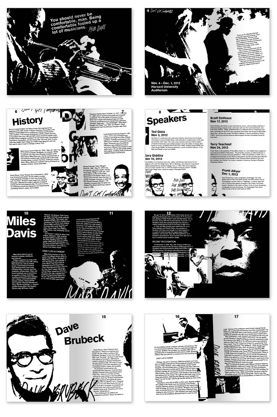
- Format can be either a booklet or a large-format poster that can be folded down into a booklet.
- Typography only. No photography, no illustrations, etc. You may use typography to create illustrations.
- Distorting type is encouraged. To quote David Carson, “Don’t mistake legibility for communication.”
- Typography cannot be handmade/hand-illustrated. However, you may print out type and distort it with a scanner.
- At least one spread must not contain white/negative space; it must be wall-to-wall text. (You can have margins/gutters.)
- A maximum of two typefaces may be used. Different weights and styles do not count against the maximum two, so feel free to use whatever is available for each font family.
- You may use color.
Solution
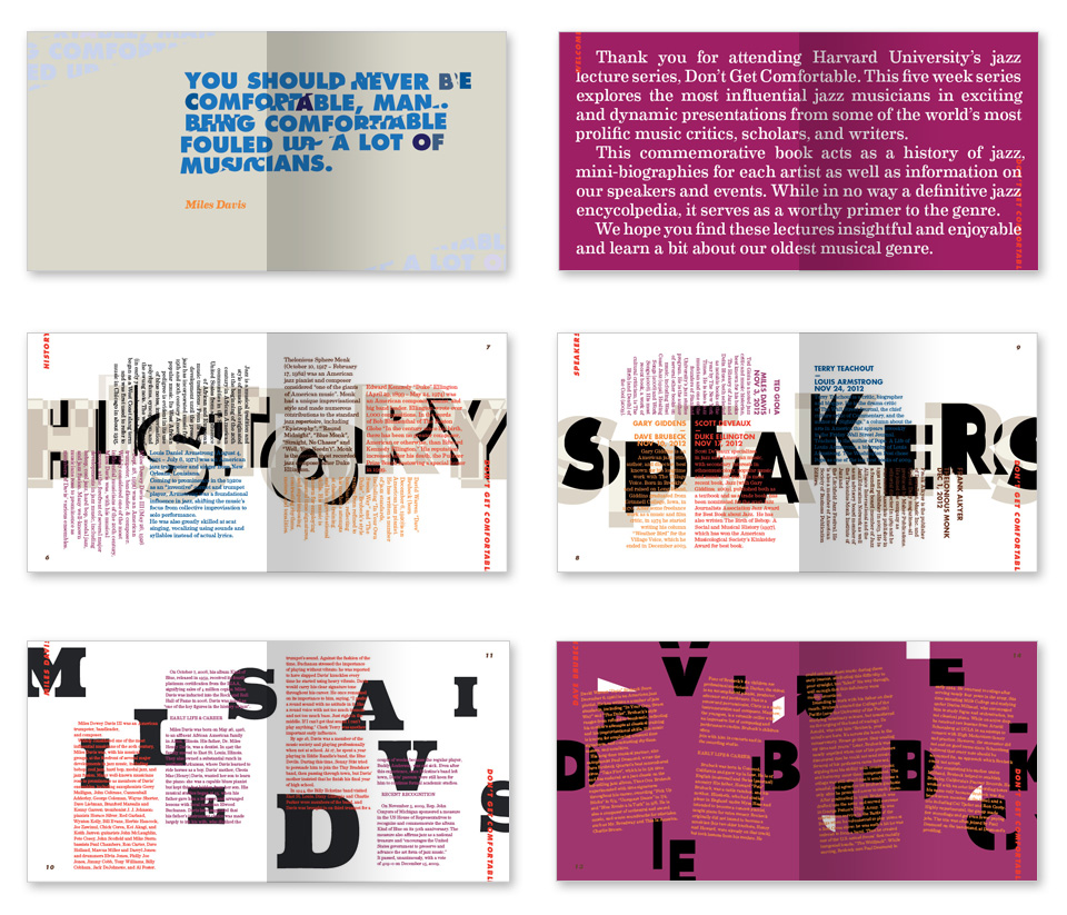
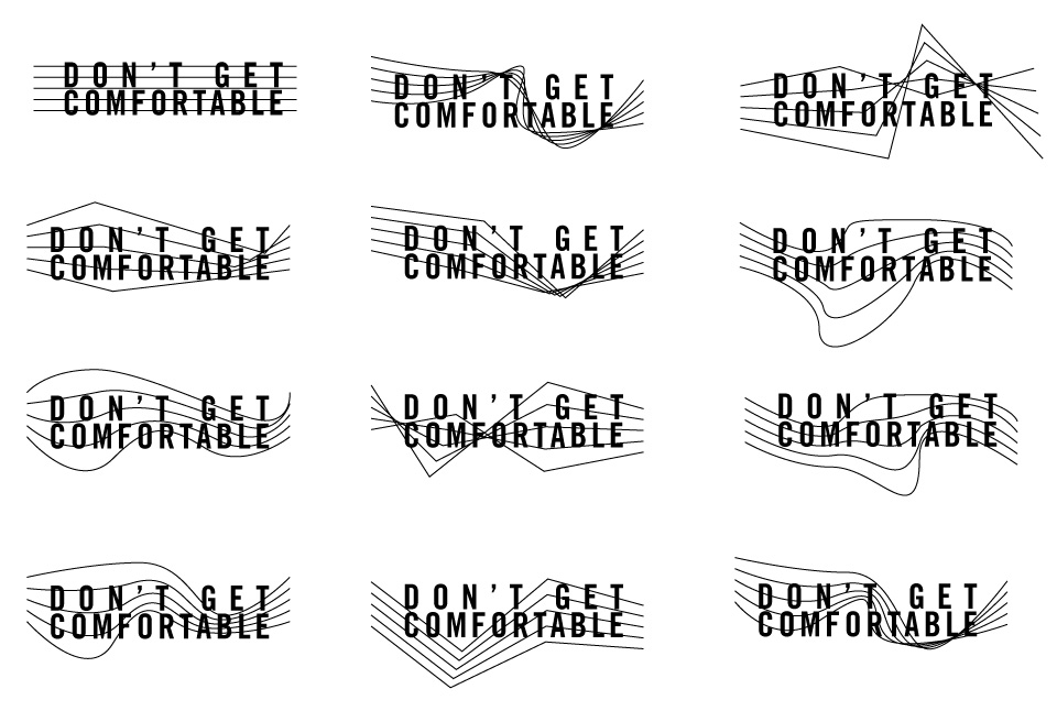
This week found myself following a strange process. While the idea of the of an all type book appeals to me, distorting and bastardizing text doesn’t interest me much at all. I’m rarely drawn to work that uses typography in this way so while the actual design of the book wasn’t very hard, getting myself excited about working on it proved more difficult this time around. I spent the majority of my time playing with type—messing it up, distorting it, seeing what I could achieve with it that I hadn’t before and I only spent the last two days actually laying out the book. In keeping with jazz’s improvisational approach and its often interesting rhythms, I echoed that feeling in these bold titles that sit across the back of the spreads that suggest the meter moving up and down (the type and color then denotes what section you are in). On the introductory pages, the type sits in a quilt-like formation loosely based on the various genres that came together to form jazz and the biography pages continue the jumping motion of musical notes. The other difference you’ll notice is the book was increased in size to a square to echo an album cover.
Week Two: Rory
- You’ve used the similar long sentences, lengthy content, and bold typography both in your original design and in your first obstruction. You may not use that element this week. Do not rely on text/language to sell your product.
- The logo must be a an illustrative mark. Think Starbucks, Target, Apple. You can use type to support it if needed, but the main mark must be iconographic. Again, do not rely on the typography.
- In both the original and your first obstruction, you don’t use any photography (and looking across your entire portfolio, you continually use photography minimally). You must incorporate photography somewhere into this design. That can be on any piece: packaging, stationery, or advertisement.
- Finally, explore alternative options for packaging. The wine must not come in a bottle.
Week Three
Obstructions:
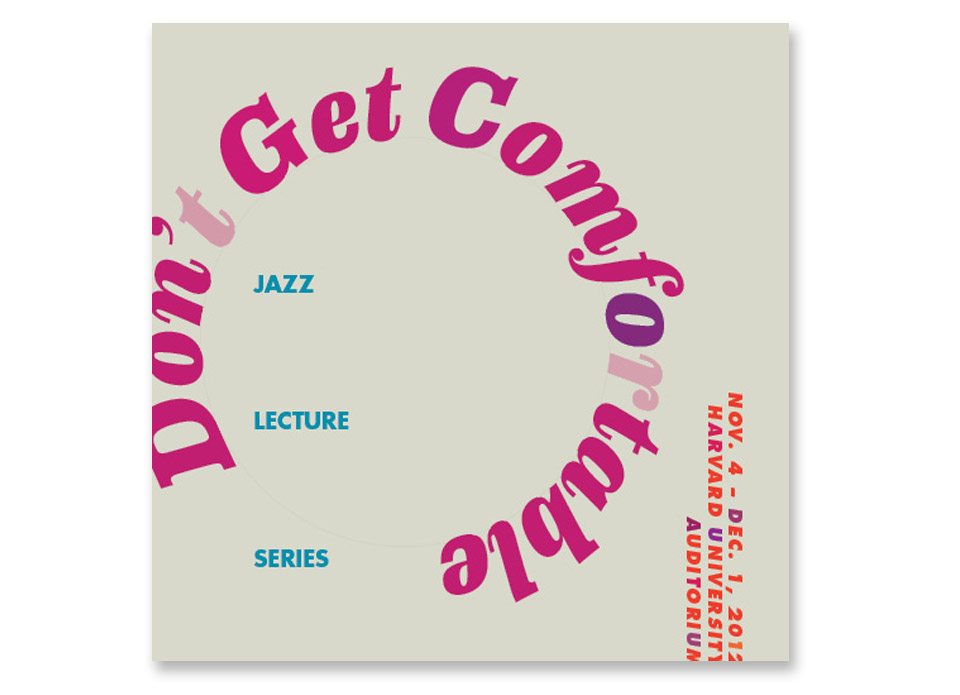
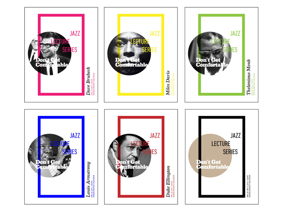
- Create an identity for the Don’t Get Comfortable lecture series: a logo, letterhead, business card, event tickets, guest wristbands, magazine advertisement, billboard advertisement and a 15–30 second TV commercial storyboard. (The storyboard drawings do not need to be detailed—simple sketches will do. But be sure to describe the overall concept and what is happening in each frame.) Remember, this identity represents the past, present and future of the event and jazz as a genre.
- You cannot use Gotham, Helvetica, or Knockout.
Solution:
Although this week’s obstruction was to design a logo and brand for the lecture series, the real challenge—or the question behind the logo—was how does one design a logo for an ever-evolving entity. Unlike a logo for a corporation or movement, I was tasked to essentially design a logo for a musical genre—something that represents both its history and its future. You used the word “timeless” in your assignment but I don’t think there is such a thing as timeless design—all design is a reflection of the time it was created. In thinking about these things, it became clear the identity had to be one that is flexible and has room to grow and change along with the lecture series, and jazz in general.
Week Three: Rory
- Use the work of Louise Filli as your inspiration for this week’s obstructions. You may also look at Charles Anderson’s work for further research. These two are seminal packaging designers with well known styles. You’re project must fit in with their work.
- The logo must be a script. You can use either a script typeface or do your own hand lettering.
- You must also use a slab serif face somewhere in your design.
- You must use illustrations. The illustrations must be of actual objects, they cannot be abstract or symbolic.
- You must use a warm color palette. You may not use white.
- Again, the design includes packaging, a stationery set, and an advertisement.
Week Four
Obstructions
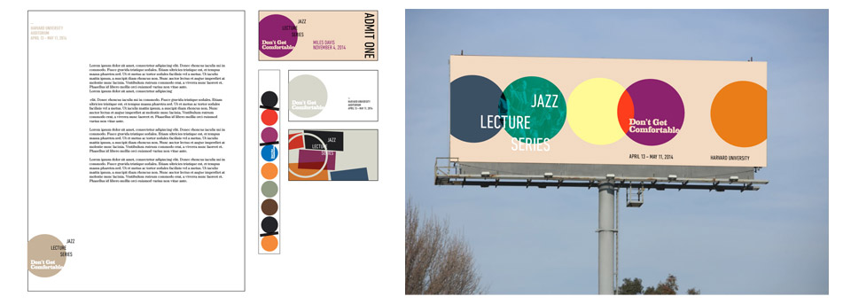
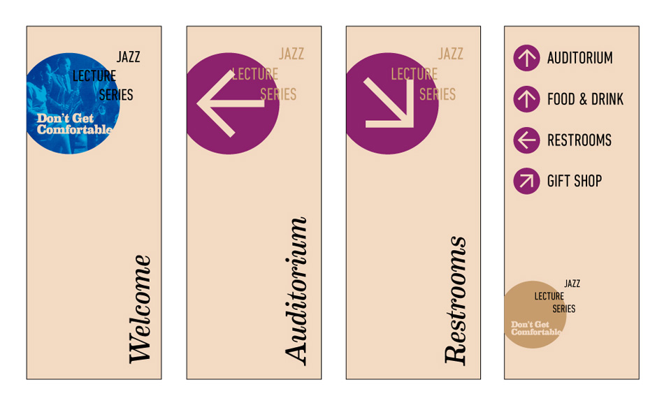
- Using your identity system from week 3, create a map-fold poster/brochure/program hybrid. The dimensions must be 19” x 25” and double sided.
- Using your identity system from week 3, create signage to be used onsite at the lecture series. Four signs in total—what they specify (bathrooms; cafe; [event] upstairs/[event] downstairs; etc.) is your choice.
Solution:
I don’t have much to say about the design of week’s obstructions because it continues the design system I started last week. I was hoping to use The Five Obstructions project to experiment with a poster/book/fold-out printed piece so I was excited to see you include that this week. It became an interesting challenge because I wanted it to work with each panel being it’s own canvas and then when folded open, it became something else. I achieved this by using a tri-fold brochure as my template but if you keep unfolding, you eventually discover a hidden poster inside it. Between the poster and the wayfinding, one can further see the customizability of last week’s identity system and the way it can respond to the content.
Week Four: Rory
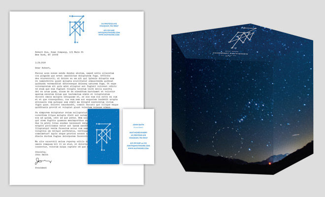
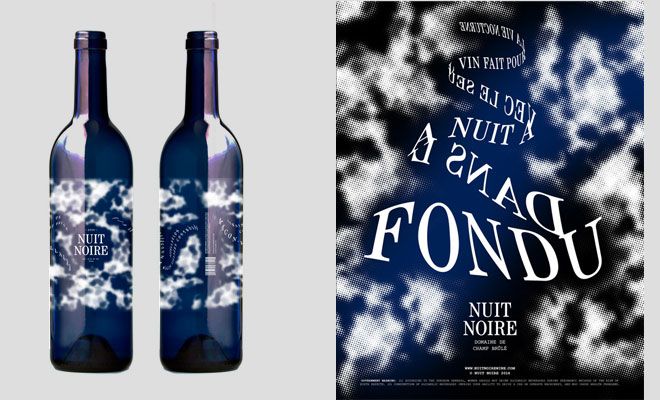
- All text must be French translations. You may not set anything in English.
- The design must be inspired by historical French design. Imagine your target audience is high end, traditional, and appreciates well made items. You may not use san-serif typography.
- Each element you create (except for the logo itself) must include a pattern or texture.
- You must use this guide to reading French labels as your guide for the label design. Every element included in that guide must be on your own label.
- Instead of the traditional stationery set I’ve had you do for the previous obstructions, this week you will focus on marketing material. In addition to the logo and bottle label, you must also design an advertisement, a cover and two spreads from a hypothetical book on Nuit Noir’s rich history.
Week Five
Obstructions
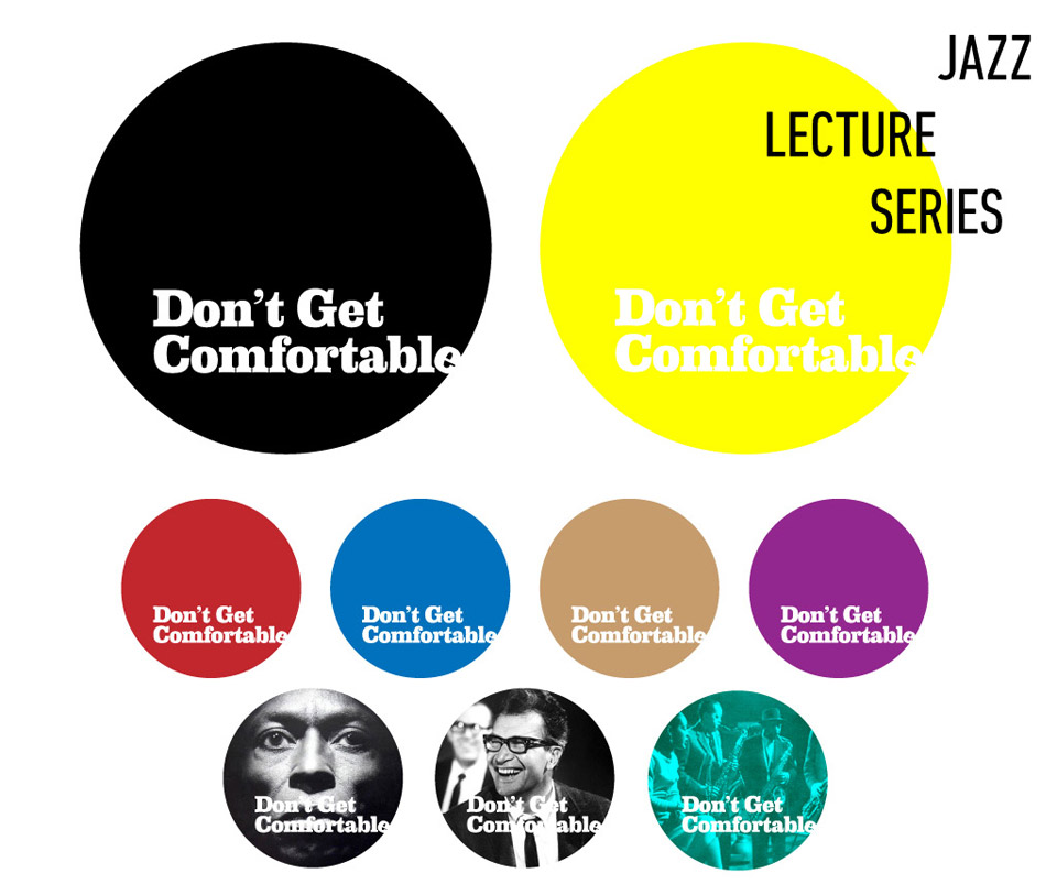
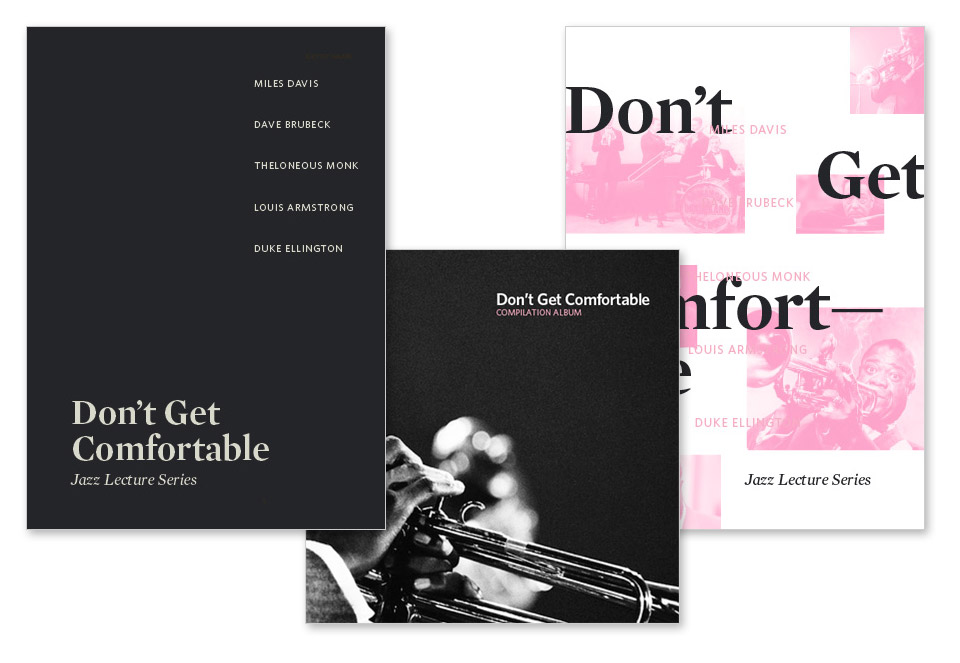
- Create a new identity for the Don’t Get Comfortable lecture series, but you cannot use any elements (color schemes, typefaces, shapes, monotone images, etc.) from your original project or from weeks 3 and 4.
- Using this new identity, design a program for this year’s event and next year’s event. You will also create album art (as a gatefold jacket, plus any inserts you feel are necessary) for a 2xLP compilation for one year of the event.
Solution
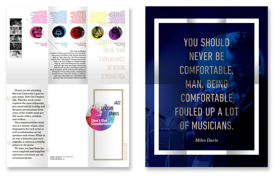
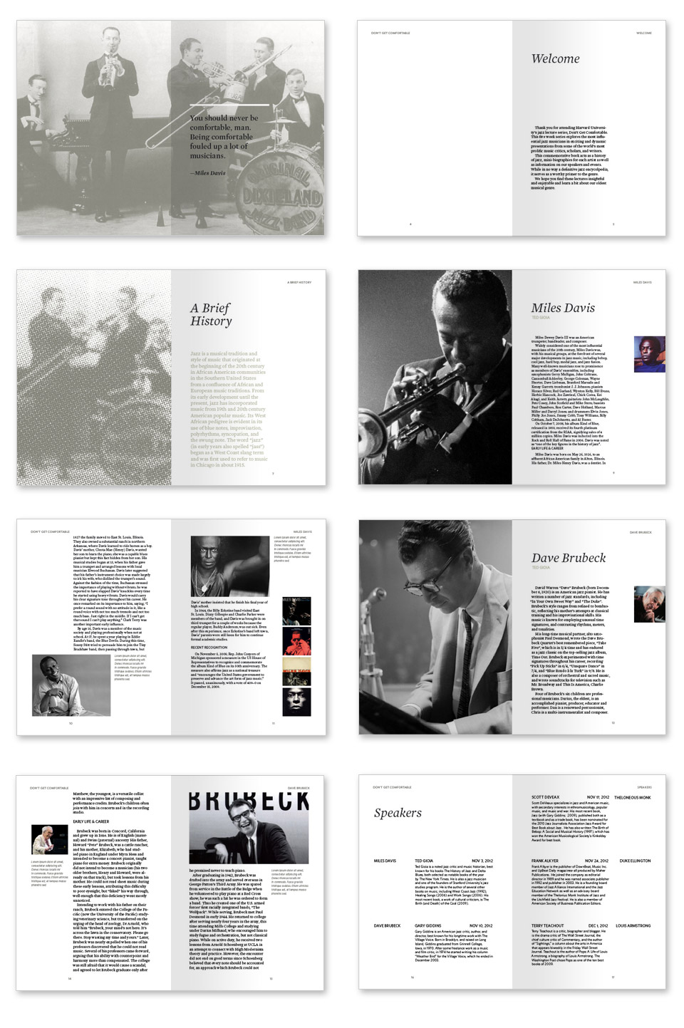
The pieces to this week’s obstructions were more diverse than any of the previous weeks—a logo, two books, and an album cover—and I approached each of them with varying degrees of separation. Because the only obstruction you gave me was I couldn’t do anything I’ve done before, I took this opportunity to explore some things I’d been thinking about through the course of this project.
The majority of my time was spent on the two books. I was curious to see how one could use the same contact and same two typefaces and produce to wildly different books—one is made for academics, the other for artists.
Week Five: Rory