MICA First Year Juried Show
Every August, the Maryland Institute College of Art hosts an exhibition showcasing the best work from the graduate program's first year students. In 2016, the exhibition was curated by New York curator Lumi Tan, who I worked with closely to develop a branding and design system for the show that stretched from exhibition design to posters and programs. Because the show was centered around first-year students, we focused on ensuring the design of the show didn't overpower the work, while also acting as a coherent element to tie together an otherwise unrelated group of artists.
- Design
- Art Direction
- Branding
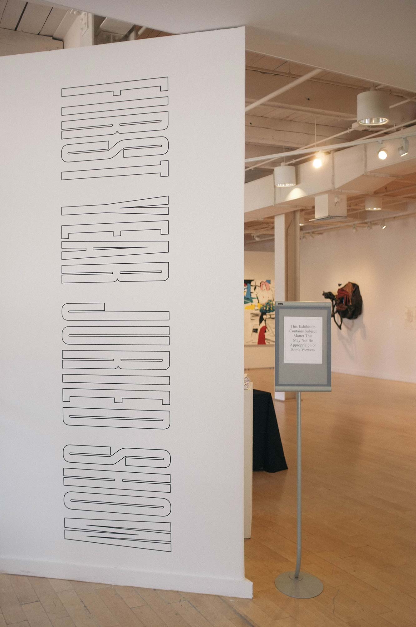
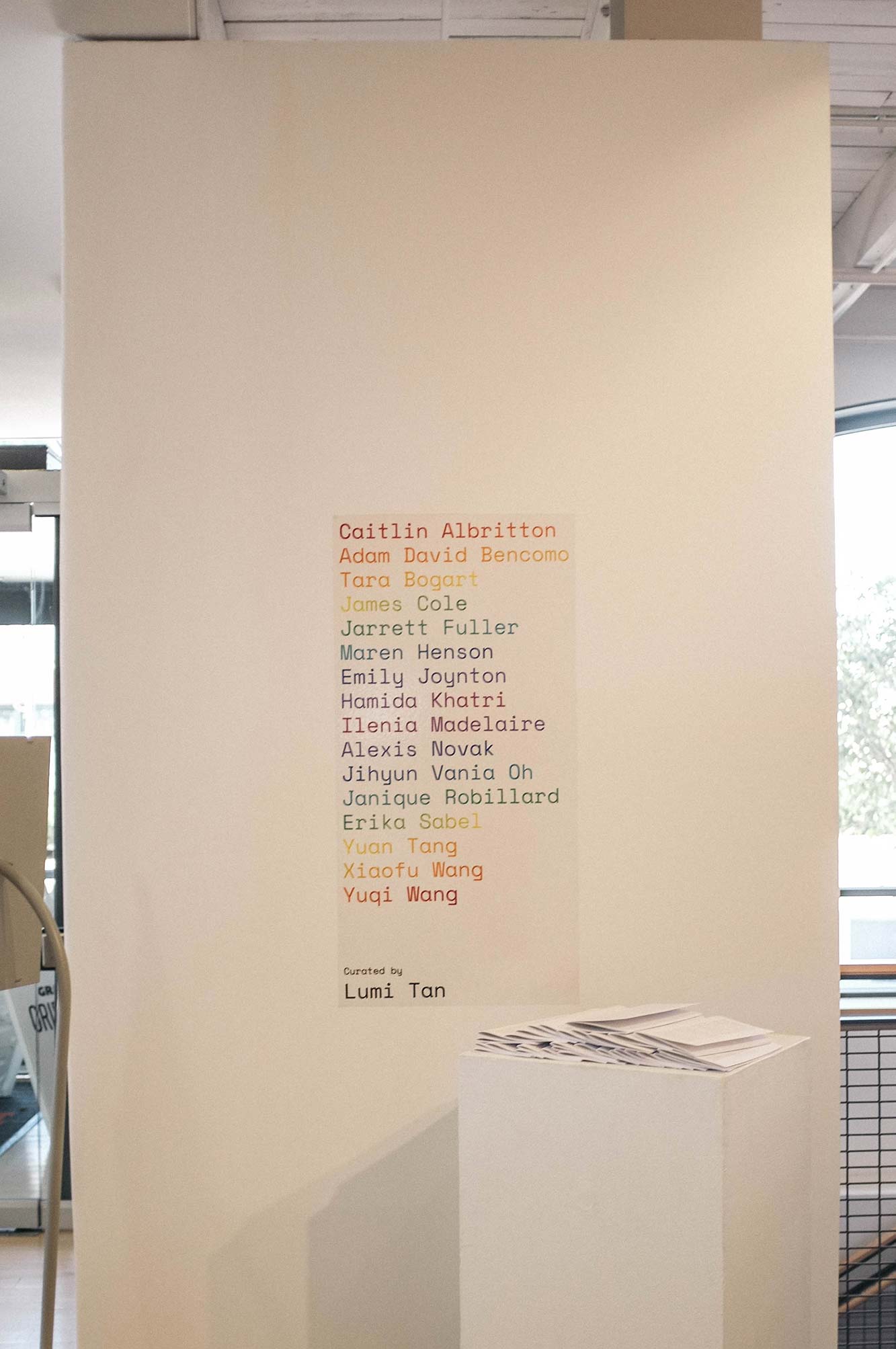
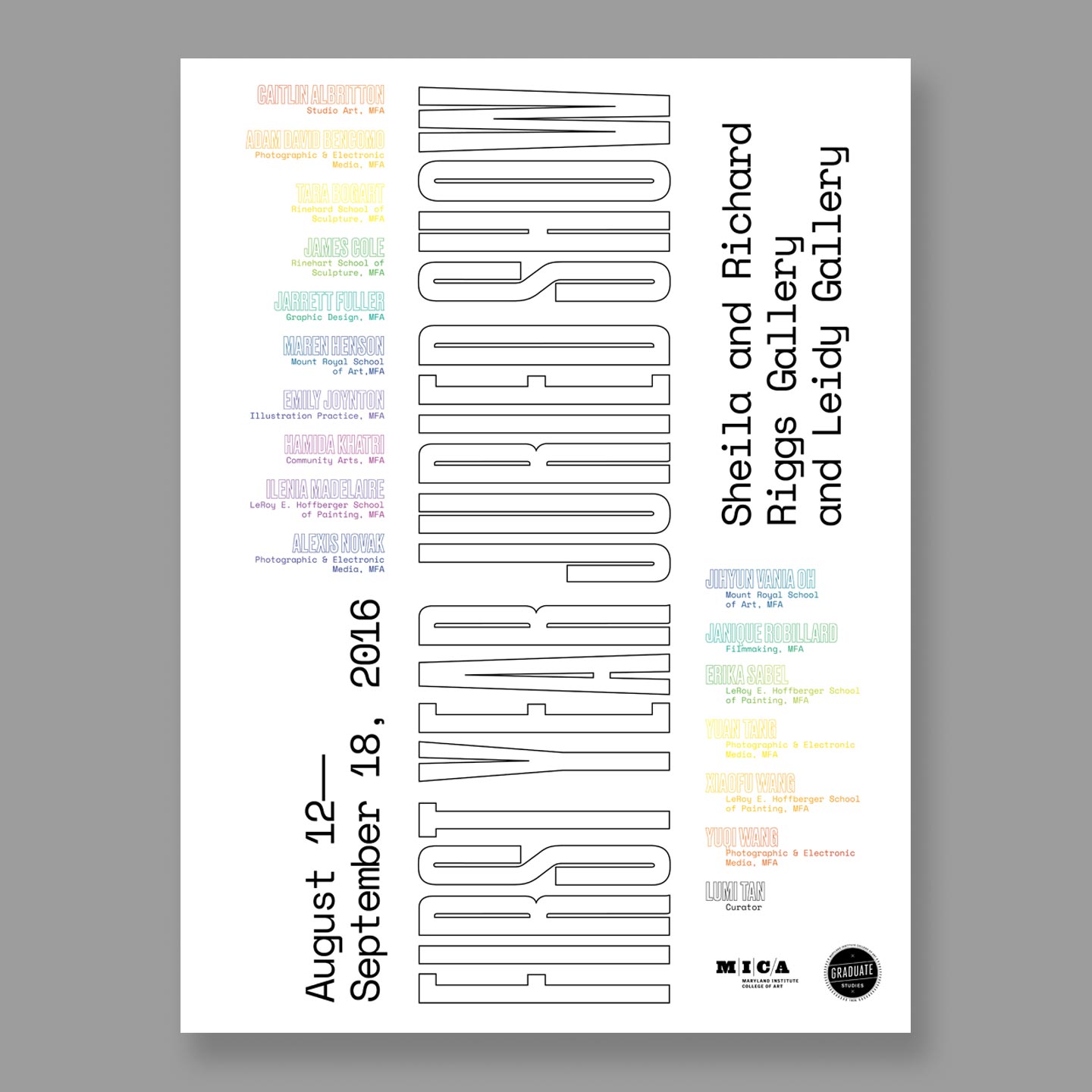
↑ The show's branding was meant to put emphasis on the individual students instead of a collective identity. The title type was outlined, causing it to recede, almost becoming invisible, while the student's names were printed in a bright a gradient.
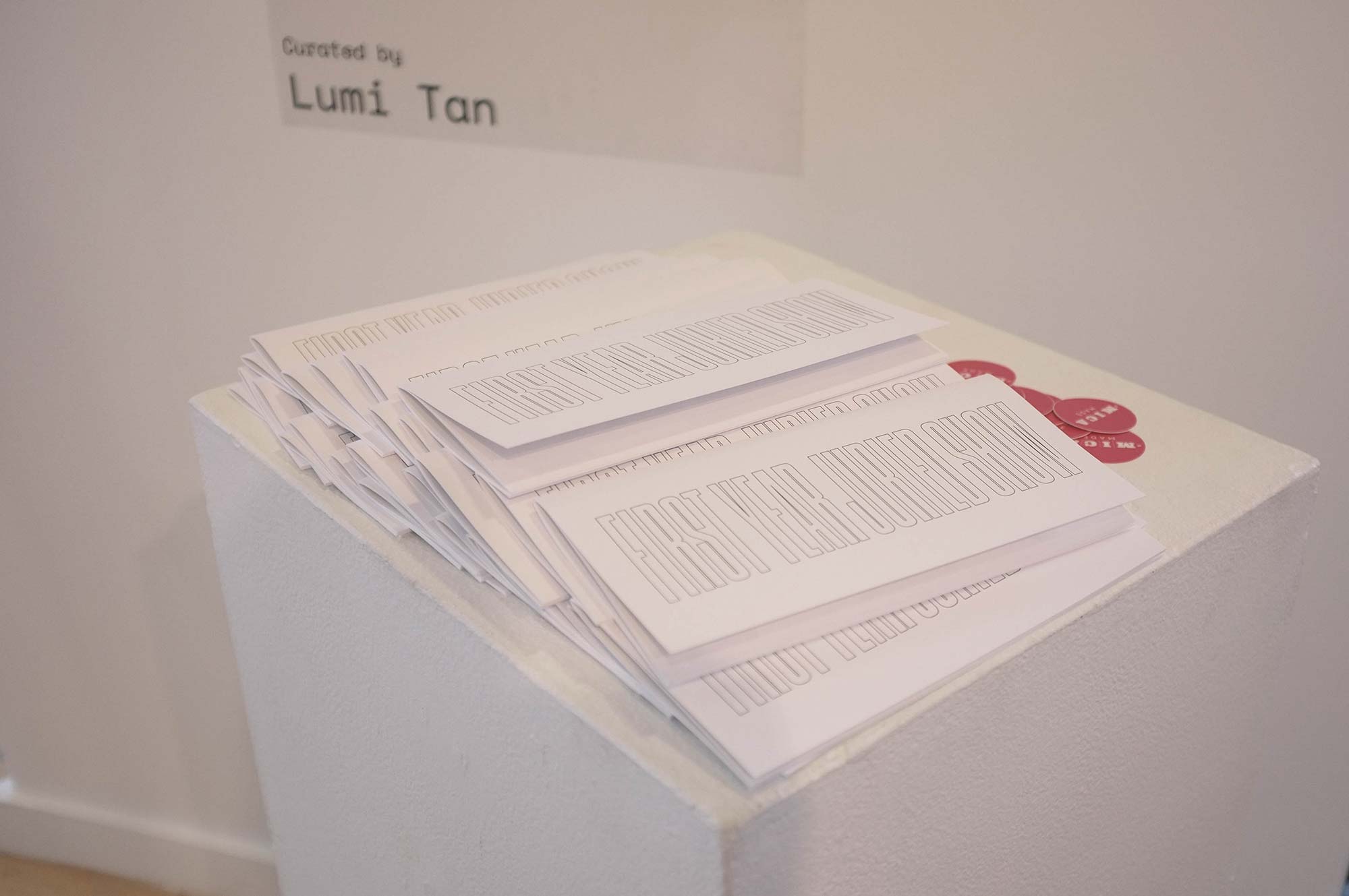
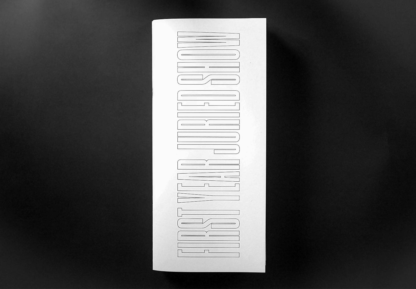
↑ The book's format echoes the title wall. Its size is the same ratio of the wall and with the title filling the entire cover.
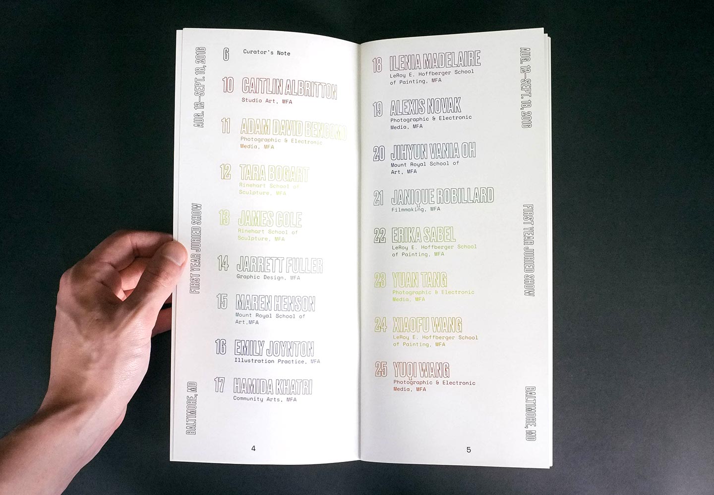
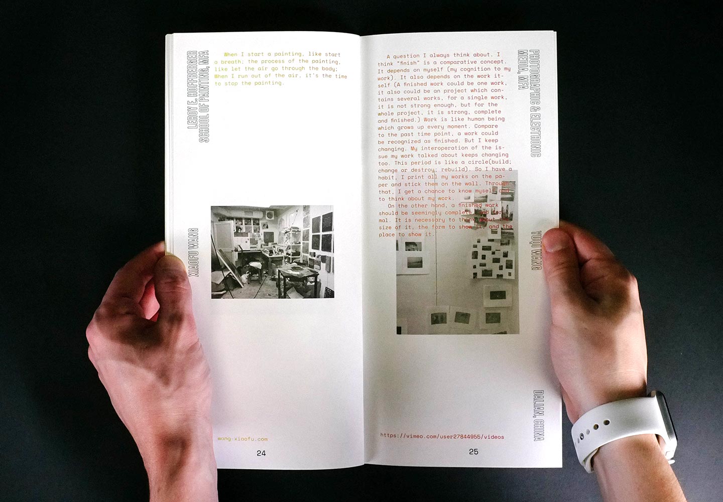
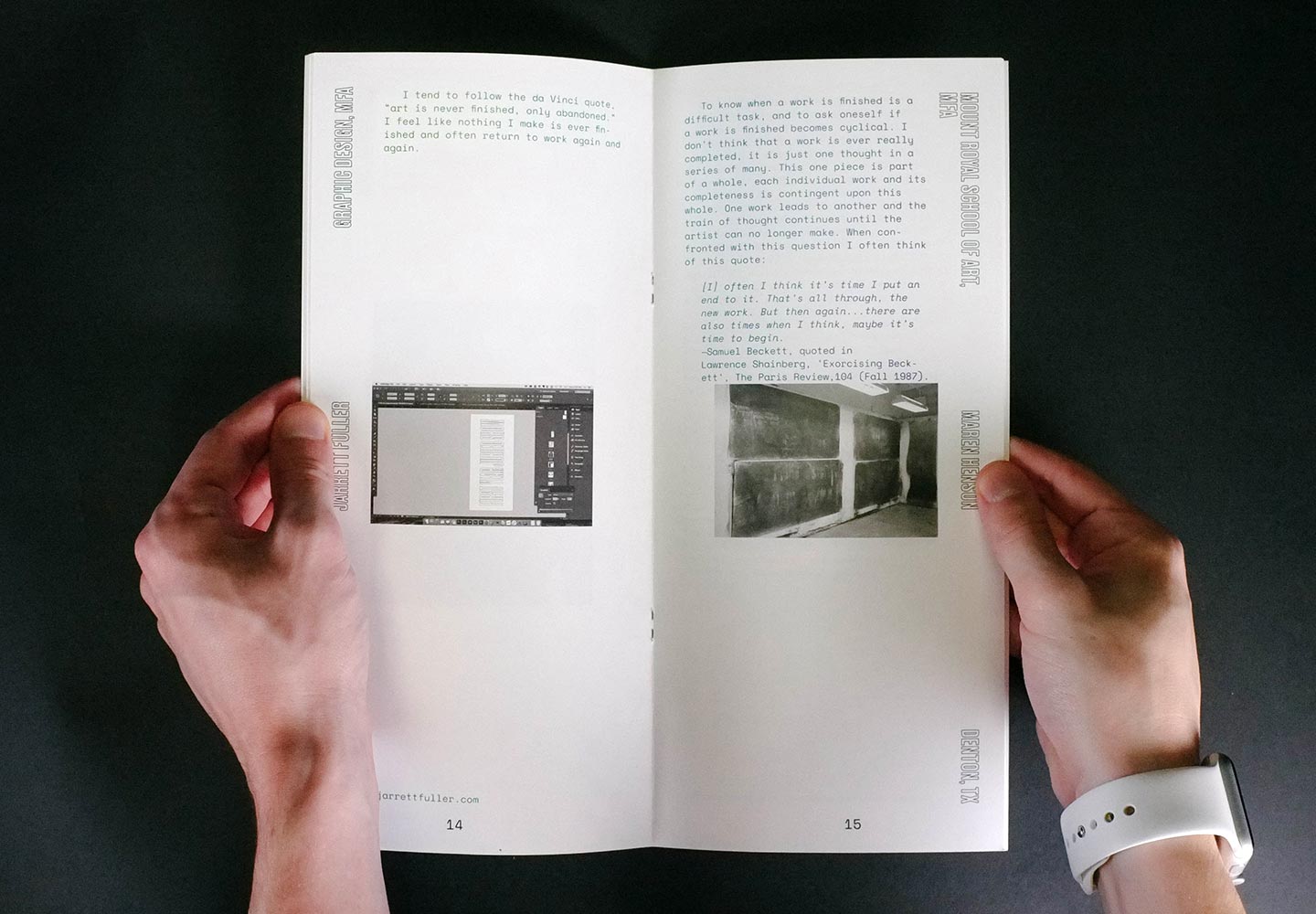
↑ To tie the students's work together, the entire book is printed with a gradient so each color bleeds into the next page. Every place a student's name appears, they are printed in the same color, breaking up the gradient throughout the space.
