Windsor: An Ode to a Forgotten Typeface
Eric Coates's 1940 orchestral serenade, By the Sleepy Lagoon, plays over a black screen. The camera opens on a textured fabric as the credits, set in black, fade over the slowly-moving camera The names of producers appear, follwed by cinematographers, actors, casting directors, assistants, and then: "Directed by Woody Allen". The film is Annie Hall and the typeface is Windsor.
Every movie Woody Allen has made since his classic 1977 film opens the same way: jazz music plays over a black screen as a the film credits appear in white Windsor. The title is always first, then it's the actors — always listed alphabetically — followed by supporting actors — also alphabetically — then a myriad of editors, producers, casting, director of photography, etc. Just as Annie Hall was the first Woody Allen film I saw — nearly thirty years after its 1977 release — that began a life-long love of the director's movies, so to did it begin the life-long affair between Allen and Windsor.
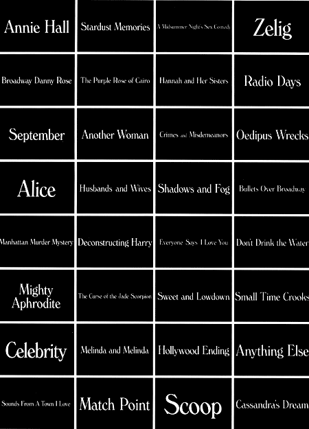
Legend has it that at the time, Allen would often eat breakfast at the same New Jersey diner as noted graphic and type designer Ed Benguiat. Allen, knowing Benguiat as a 'printer', asked him one morning — probably sometime between 1975 and 77 — for a good typeface to use in the credits of his upcoming film. Benguiat offered up Windsor. Allen seemingly agreed and used it to open Annie Hall. Every movie after, all forty of them, save for the 1979 Interiors (the only Allen film to open with a san-serif), has begun the same way. Windsor is as much a marker of Woody Allen's work as thick-rimmed glasses, neurotic characters, and New York City. It's used on his website. Books about the director use Windsor on the covers. So does Allen's own 2007 book, Mere Anarchy. Most recently, it's moved off the screen and is also used on all the promotional posters for every film since 2009's Whatever Works. I've seen every Woody Allen movie and the quality of his films fluctuates, I breath a sigh of relief every summer when I sit in the movie theater and see Windsor appear on the big screen for new film — there's a comfort in this consistency, a settling in with an old friend.
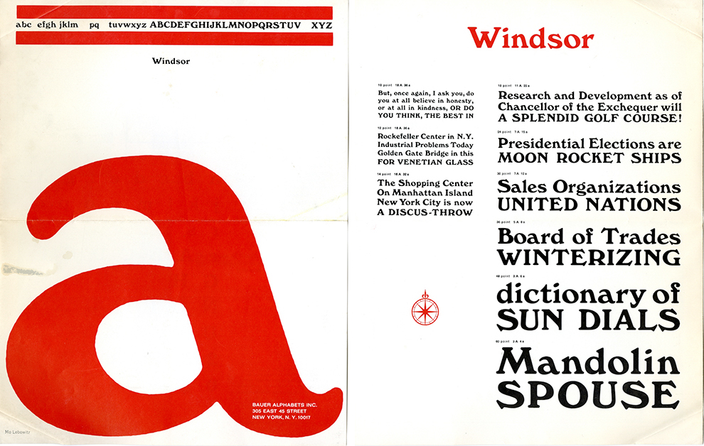
Windsor was designed by Eleisha Pechey and released in 1905. Pechey, after completing an apprenticeship in printing and bookbinding, began working for Stephenson, Blake & Company in 1863, the London type foundry that until the 1990s was the last active type foundry in England. Pechey died in 1903, a few years before Windsor would be released, making it one of his two typeface releases. Windsor is probably best described as a sophisticated cousin to the more well-known Cooper Black, designed in 1921 by Oswald Bruce Cooper. Where Windsor often evokes a distinct literary quality, Cooper Black goes for something softer. (Incidentally, Woody Allen used Cooper Black in two of his first films: What's Up Tiger Lily? and Bananas, and Time used it when they put Woody Allen on the cover. Cooper Black is also frequently used by Louis C.K, a comedian known to take inspiration from Allen.)
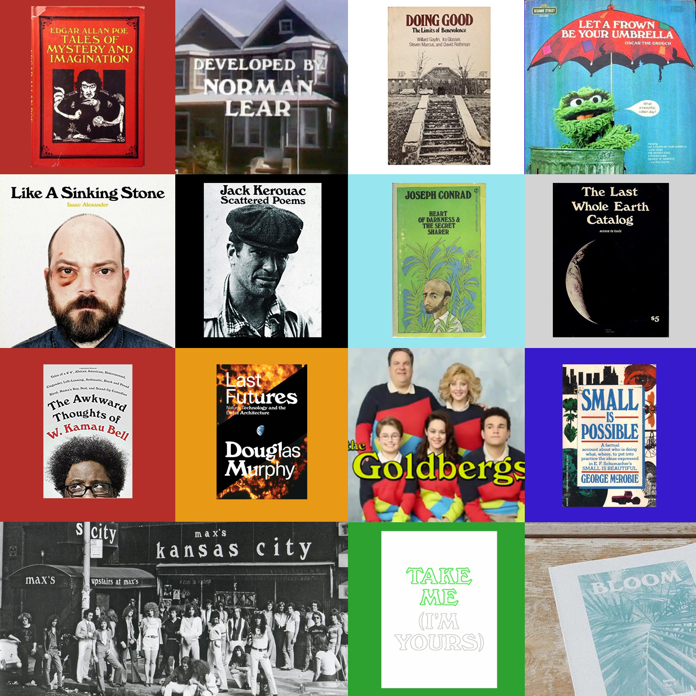
Despite its distinct visual characteristics — the extra-wide M's and N's, the curious curve of the lowercase 'f' — Windsor is surprisingly versatile and can be found in a curiously diverse range of applications, reaching peak popularity in the late sixties and early 70s. Stewart Brand used it for the masthead of his Whole Earth Catalog, television shows like The Price is Right, The Goldbergs, 227, and All in the Family have used it in their opening credits. Sesame Street used it on the cover of the 1979 Oscar the Grouch musical album, Let a Frown Be Your Umbrella. Nightclubs like New York's Max's Kansas City and Minneapolis's First Avenue and 7th St. Entry have used it in their logos. It's a popular book cover typeface where it's employed on a range of covers from Joseph Conrad's 1950 edition of Heart of Darkness to the 1971 edition Jack Kerouac's Scattered Poems to the 1983 edition of Edgar Allen Poe's Tales of Mystery and Imagination. Less popular than it was a half-century ago, Windsor still finds it way into contemporary graphic design: The comedian W. Kamau Bell is using it for the cover of his 2017 book; Stumptown Coffee's new brand-zine, "Bloom", uses Windsor in its masthead; Arkansas musician Isaac Alexander's 2017 album Like a Sinking Stone uses it on the cover; and the 2016 exhibition at The Jewish Museum, Take Me (I'm Yours), uses it for the titles, book, and promotional material.
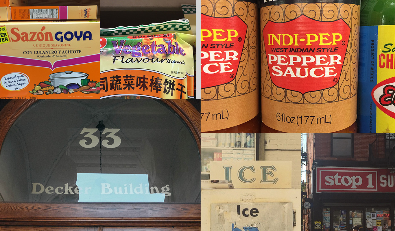
As a teenager, watching Annie Hall and quickly following with the rest of Allen's filmography, a specific picture of New York was painted for me. When I moved to the city years later, I was surprised to see the New York I now resided in was not the one in Allen's movies. But as I walk around the city, sometimes still reconciling this split, Windsor shows up in unexpected places: I've seen it on laundromat signage and food packaging, on the front of menus and building address markers. As The Guardian wrote of the director's typographic sensibilities, "Allen clearly adores Windsor as much as he does New York." Perhaps because of this, in my mind, Windsor represents New York. And in a strange way, when I see Windsor — a typeface designed a century ago in London — I see Allen's New York.
For all its versatility, however, Windsor is largely forgotten in the canon of design history. I've never seen a colleague use it and it's yet to be used in a 'famous' piece of design or skillfully used by the design greats. I'd never heard a professor mention it — either in my own undergraduate typography course or the various design history classes I've taken over the years. It doesn't make the list of classic typefaces alongside Bodoni or Garamond, but also is absent from the infamous typographic blacklists handed out to sophomore Typography students advising them to avoid faces like Comic Sans and Papyrus. Perhaps it's too hard to work with — its angled lower-case a's and n's can make it hard to kern, the width of the letters can make it overly chunky, and it falls somewhere between playful and serious, distinct and anonymous. But it's these elements that draw me to it. Despite my love for these quirky characteristics, I've yet to find a use for it in my own work, yet I keep trying.
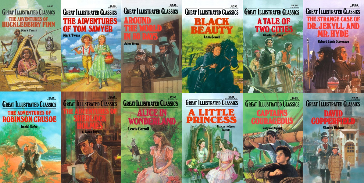
Last year I was home from graduate school visiting my parents. On a particularly boring day, I started cleaning out my childhood bedroom and came across my collection of Great Illustrated Classics, Waldman Publishing's collection of classic novels rewritten for elementary school children. I had discovered the series when I was in third grade and would plow through books like Around the World in 80 Days and Treasure Island in just a few days. Some of my earliest memories of reading were with these books and my love of reading began with this series that took up multiple shelves on my bedroom bookshelf. Packing them into boxes to move to storage — they were too sentimental to get rid of just yet — I was struck by the covers. They were all set in Windsor. Perhaps that's why I was taken with it when I saw it many years later opening a Woody Allen movie, and why I continually find it a fascinating and challenging typeface. It was there when I learned to love reading, it was there when I found Woody Allen, it was there when I moved to New York.
When I was asked my favorite typeface by professors and classmates in school, I'd give the default, the 'good designer' answers: Helvetica, Akizdenz, Plantin. And now years later, when I'm asked the same question by my own students, I still find myself giving these stock — these safe — answers. But the answer I really want to give is the typeface on the cover of my first favorite books and in the opening credits of my favorite movie, that curious and often-overlooked typeface on food packaging and album covers and the buildings I pass in New York. The real answer is Windsor. ✖